Nikunj Tyagi.
Product Designer
designing end-to-end, from design systems to risk-sensitive ux.

Summary
Product Designer working on trust-critical UX for travel and payments - risk mitigation, precision, and reliable booking experiences.
Experience
User Experience Designer
Oct 2025 - PresentAirIQ 365 · Gurugram, India
- Designed the complete B2B flight booking experience across desktop and mobile, cutting agent task completion time by 22% and lifting overall booking efficiency by 28%.
- Handled 5 distinct risk states across payment, credit/debit and amendment flows, turning a high-stakes process into calm, trustworthy UX.
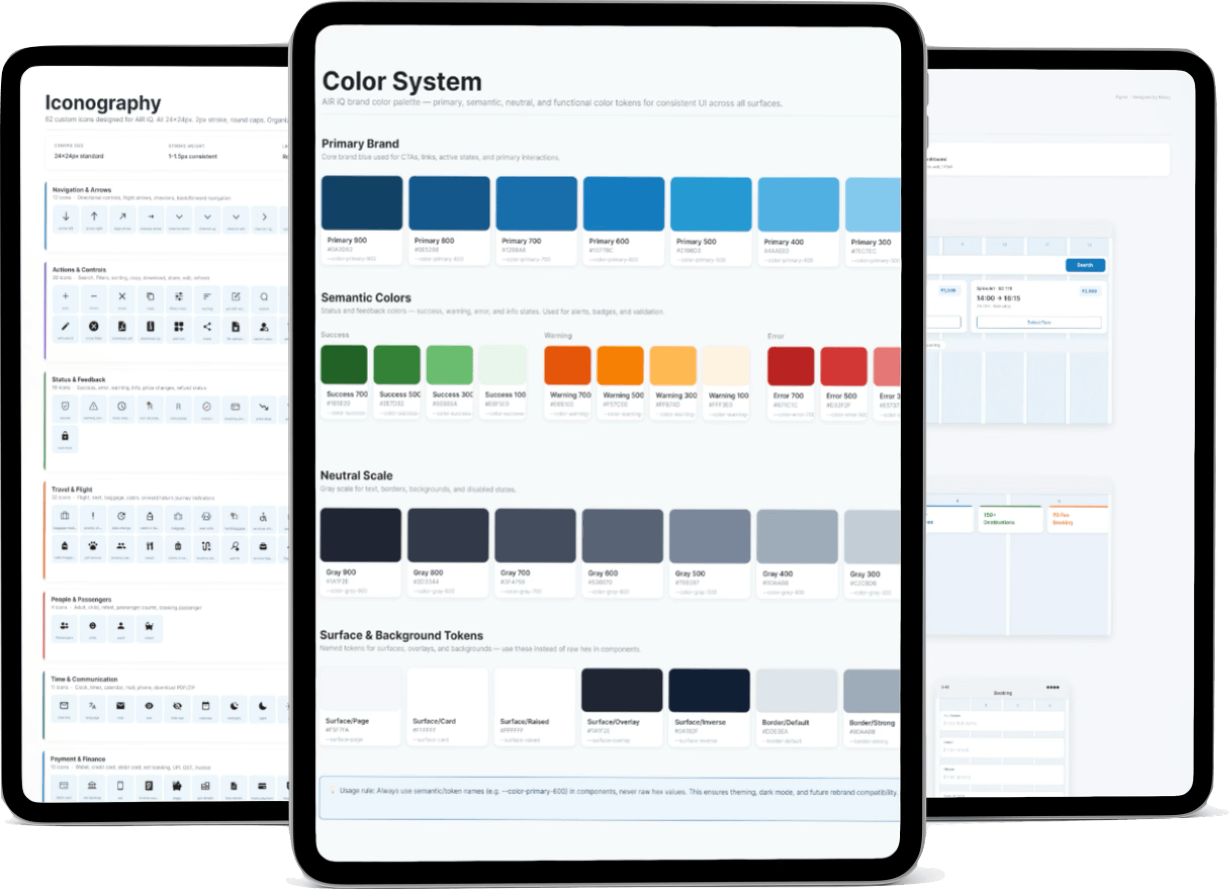
- Extended the same tokens and components to build hotel booking and a payments dashboard from scratch - both spec'd and ready for release - proving the system could scale to a second vertical without a redesign.
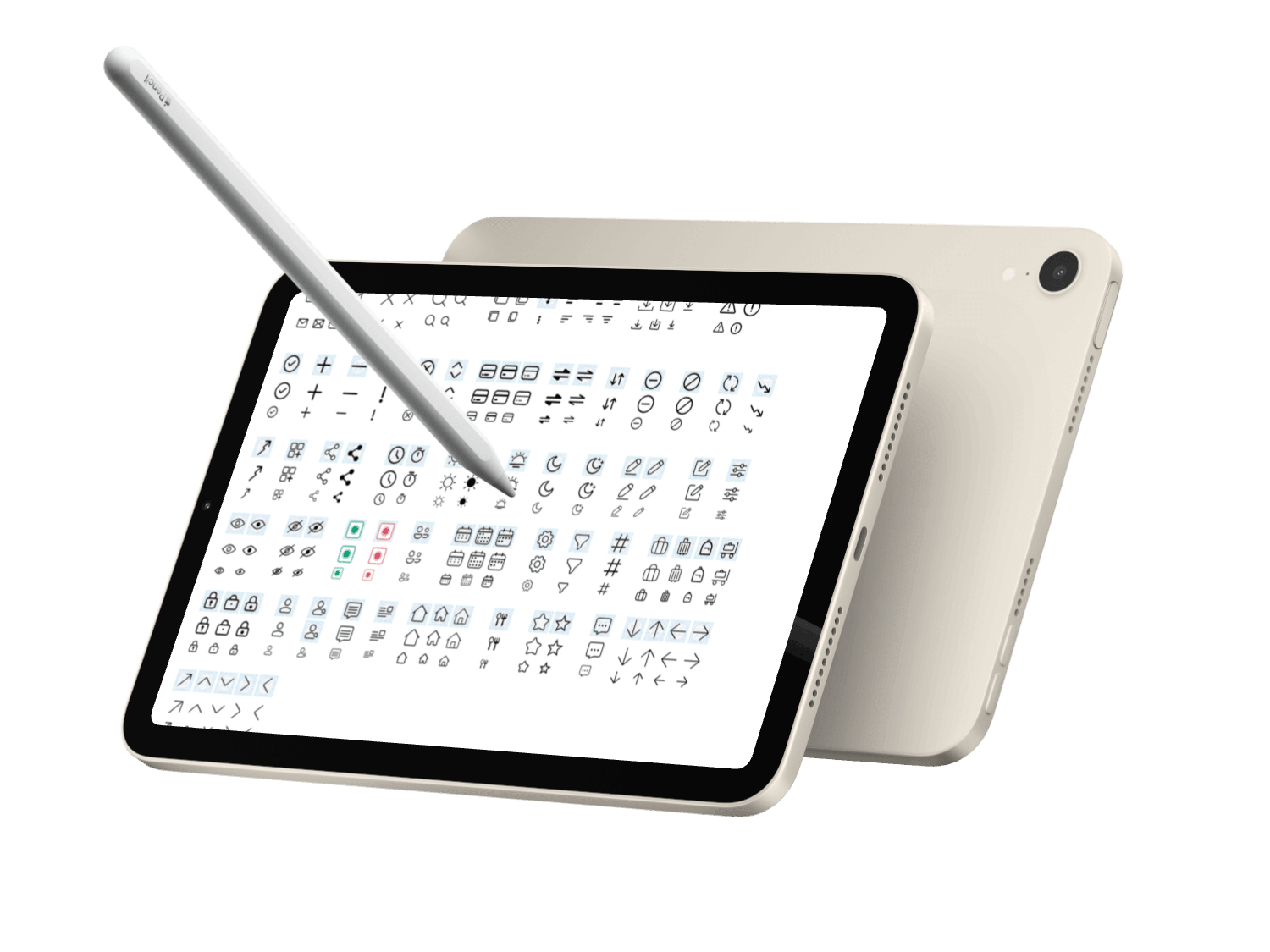
- Built AirIQ 365's 121-icon custom SVG library across 7 functional sets, replacing a third-party icon set, shipped with a Figma component library and developer handover doc.
Product Designer (Contract)
June 2025 - Sept 2025Sakhi
- Joined a shipped menstrual health app as external designer, reframing it from a passive log into a product that surfaces cycle patterns over time.
- Rebuilt an overloaded onboarding screen into a single-focus flow, fixing the app's biggest drop-off point - live on the App Store, with 500+ active users since.
- Designed Care Mode and Sakhi AI, extending the product past tracking into personalised guidance and conversational support, with direction validated against four years of existing research and reviewed by the team that shipped v1.
UI Designer Intern
June 2024 - July 2024Infosys
- Owned UX for Bibliofi, an iOS library management system, working with a team of 10 developers to take 3 core flows from SRS to locked spec inside a 4-week sprint.
- Ran research across 38 student surveys, 8 in-depth interviews and 2 librarian conversations, surfacing gaps the SRS missed - including queue visibility and off-site borrowing.
- Translated a dense SRS into IA, wireframes and annotated flows, writing design rationale directly in-file so developers could resolve ambiguity without waiting on me.