

Built for a bigger screen
This case study has detailed visuals, interactions, and layouts that are best experienced on a desktop or laptop.
← Back to portfolioor rotate to landscape for a peek
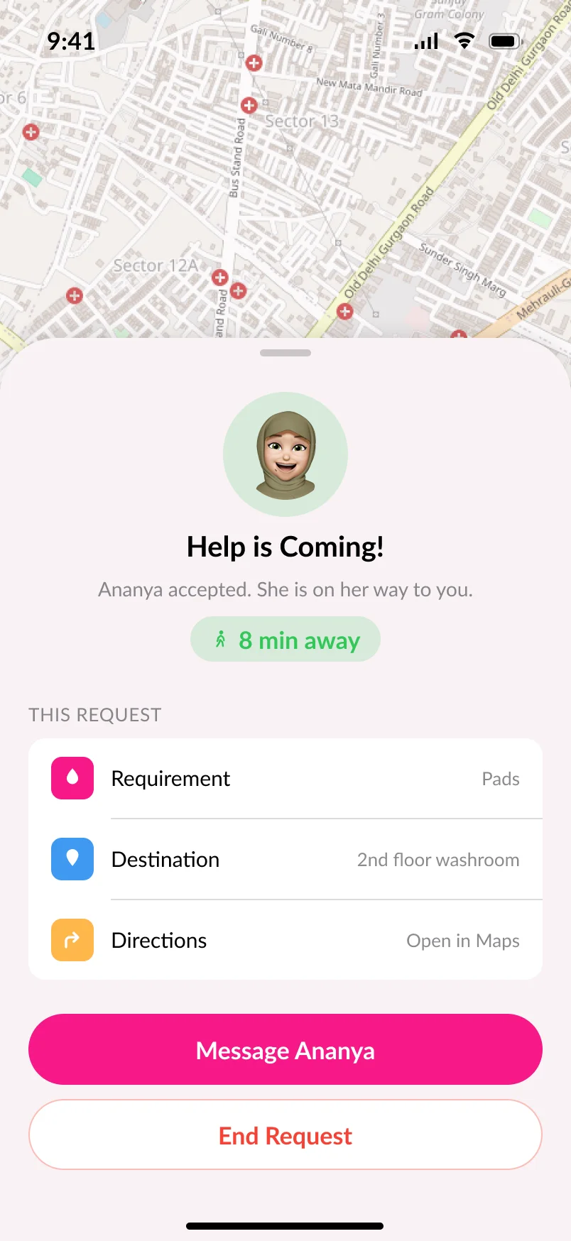
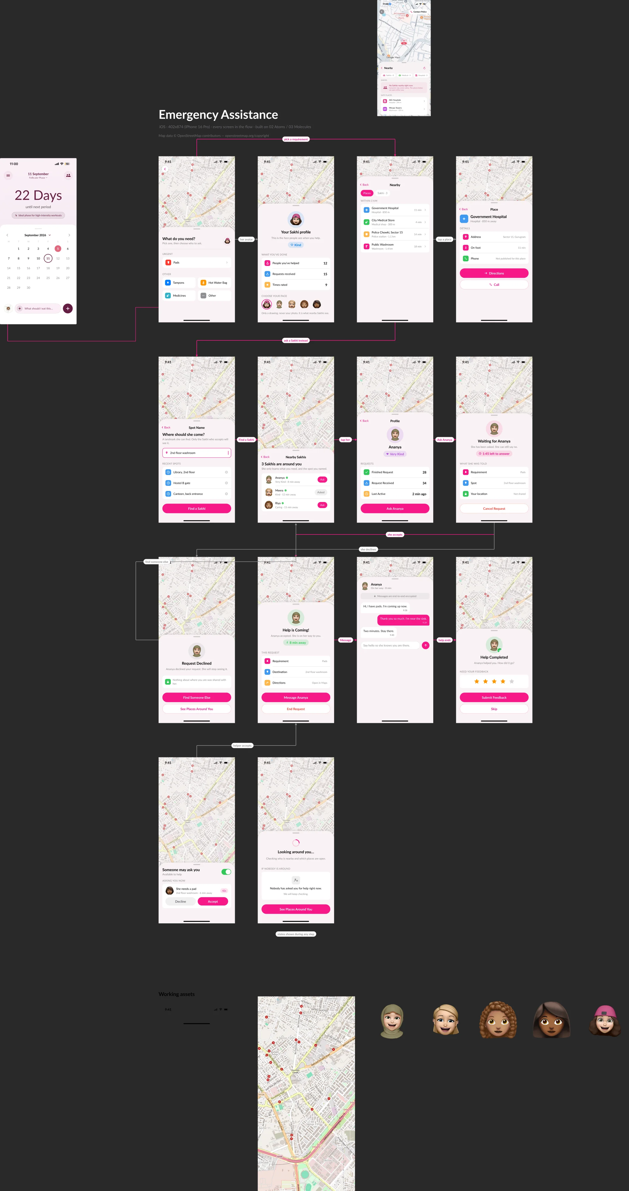
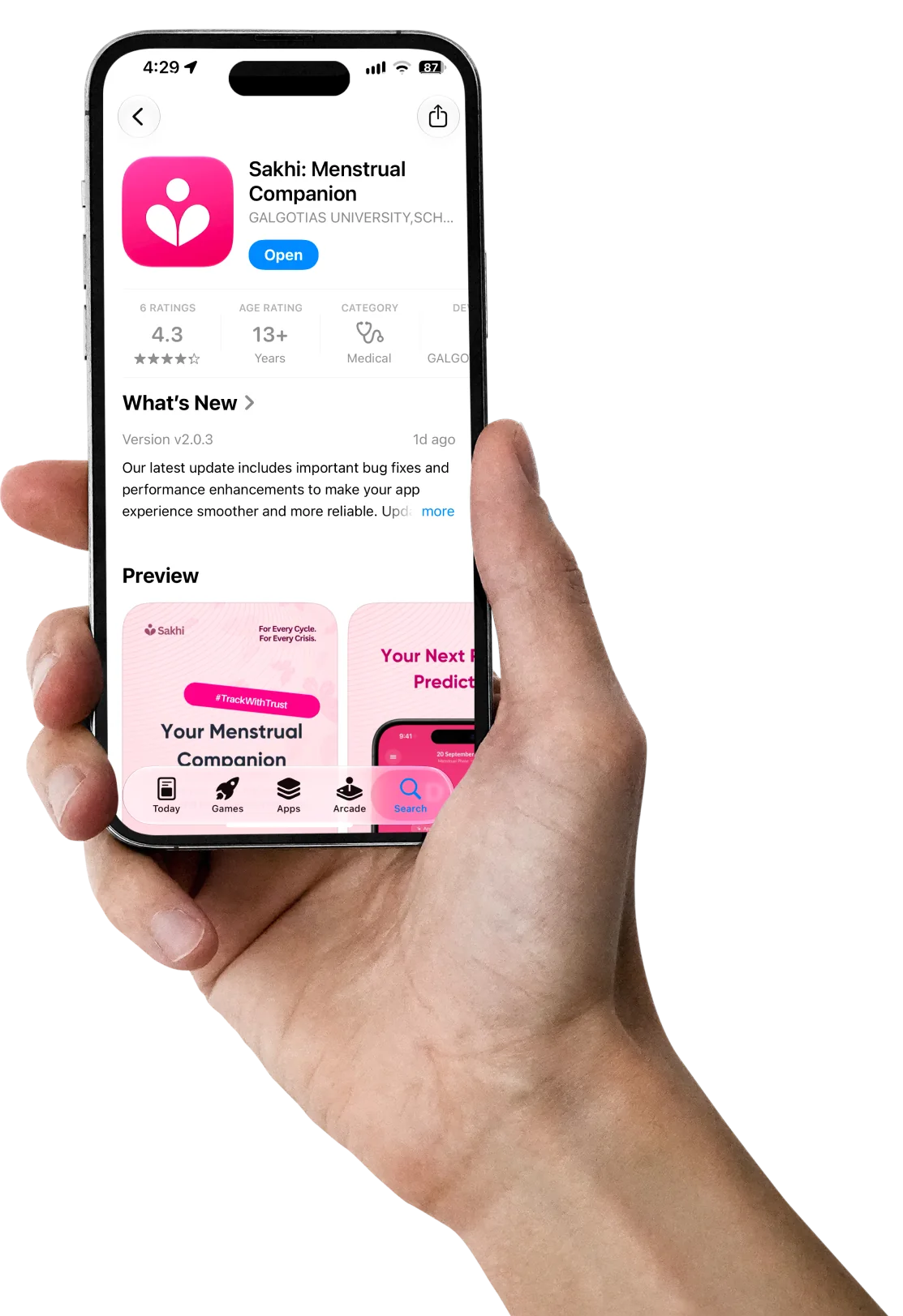
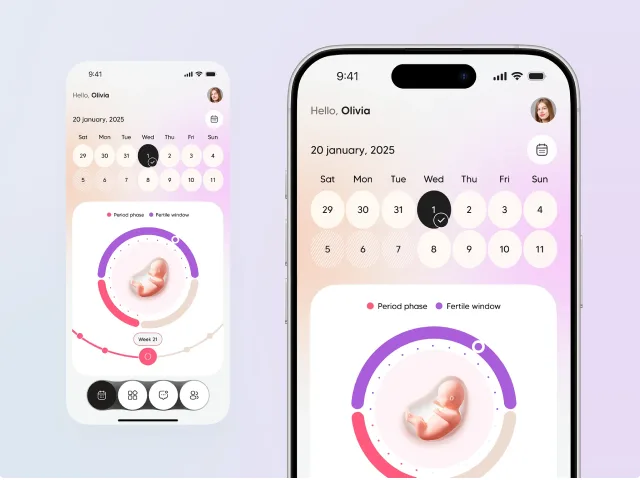
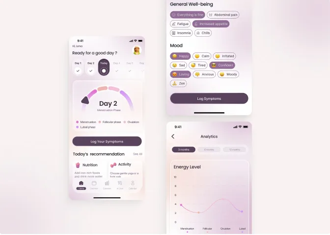
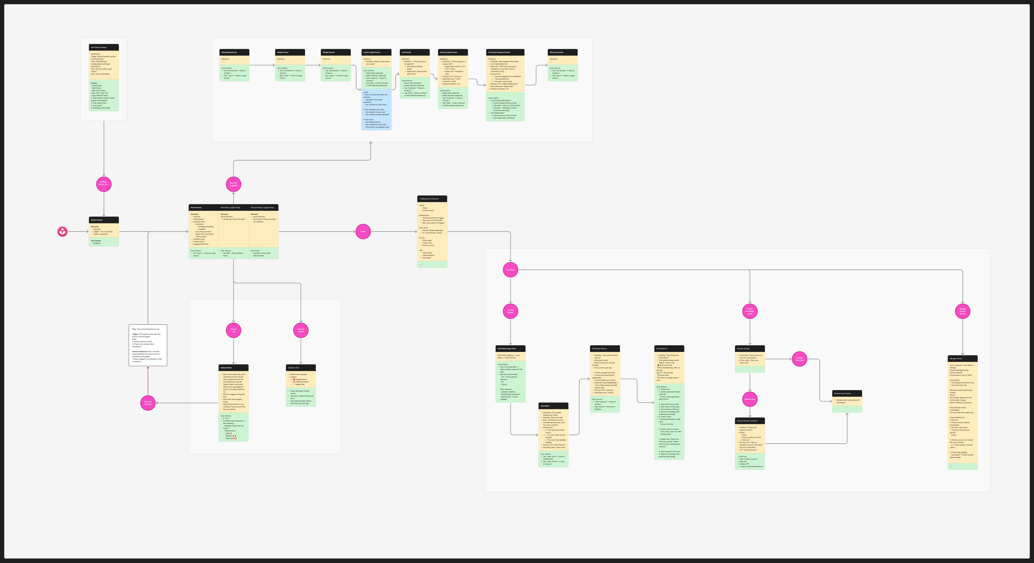
Sakhi is a menstrual health companion for Indian women, built by Team Sakhi through the ISDP Bootcamp and Apple incubation. It launched on the App Store in June 2025 - designed, at that point, by the team’s in-house design lead.
After launch, Team Sakhi had a retention problem they couldn’t explain: users onboarded, logged diligently for about three months, then stopped opening the app. They hired me as the product designer on the next version with a deliberately open brief - work out why, then redesign around the answer.
What I found wasn’t a broken feature. The app tracked cycles competently; it just couldn’t answer the only question its users actually had: is this normal for me?Predictions ran on population averages in a market where 1 in 5 women has PCOD and 70% of them don’t know it. Three months of diligent logging returned a calendar and nothing else.
So I reframed the brief from “improve retention” to something the team could actually design against: move from an app that records what happened to one that interprets what it means for her specifically - and gets her to a doctor with evidence in hand.
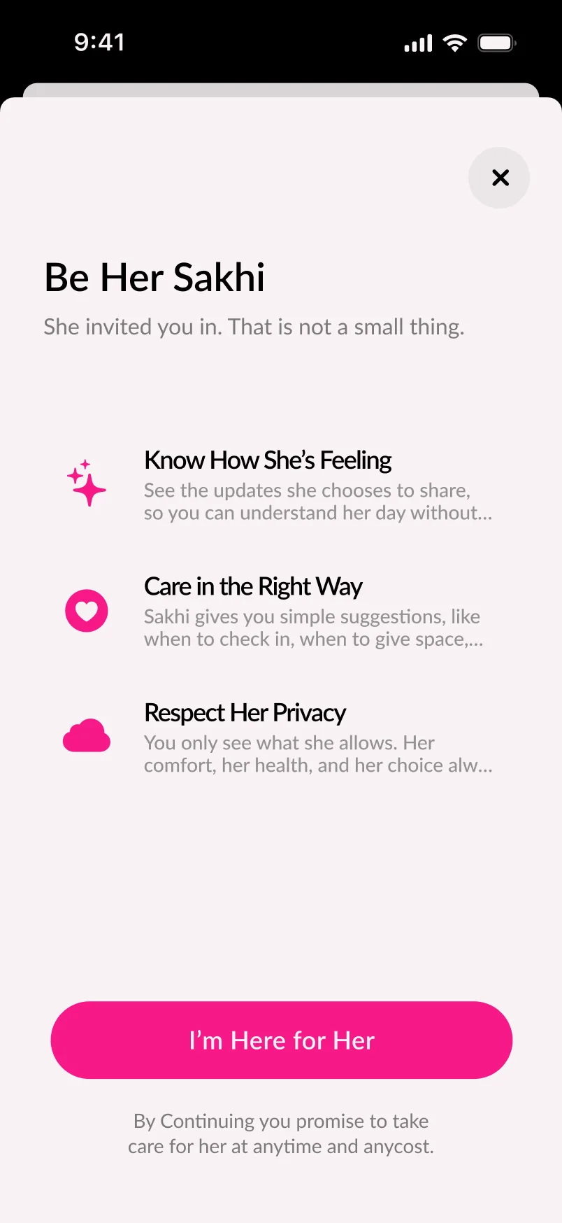
Three changes carry most of the redesign - what she is asked for, what she gets back, and where the whole thing is pointed.
Onboarding
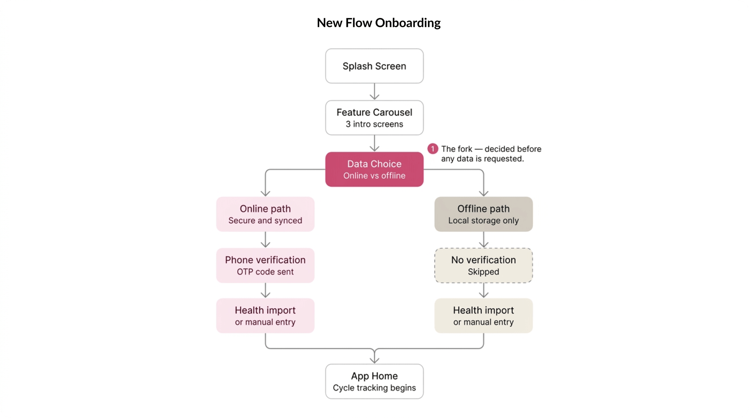
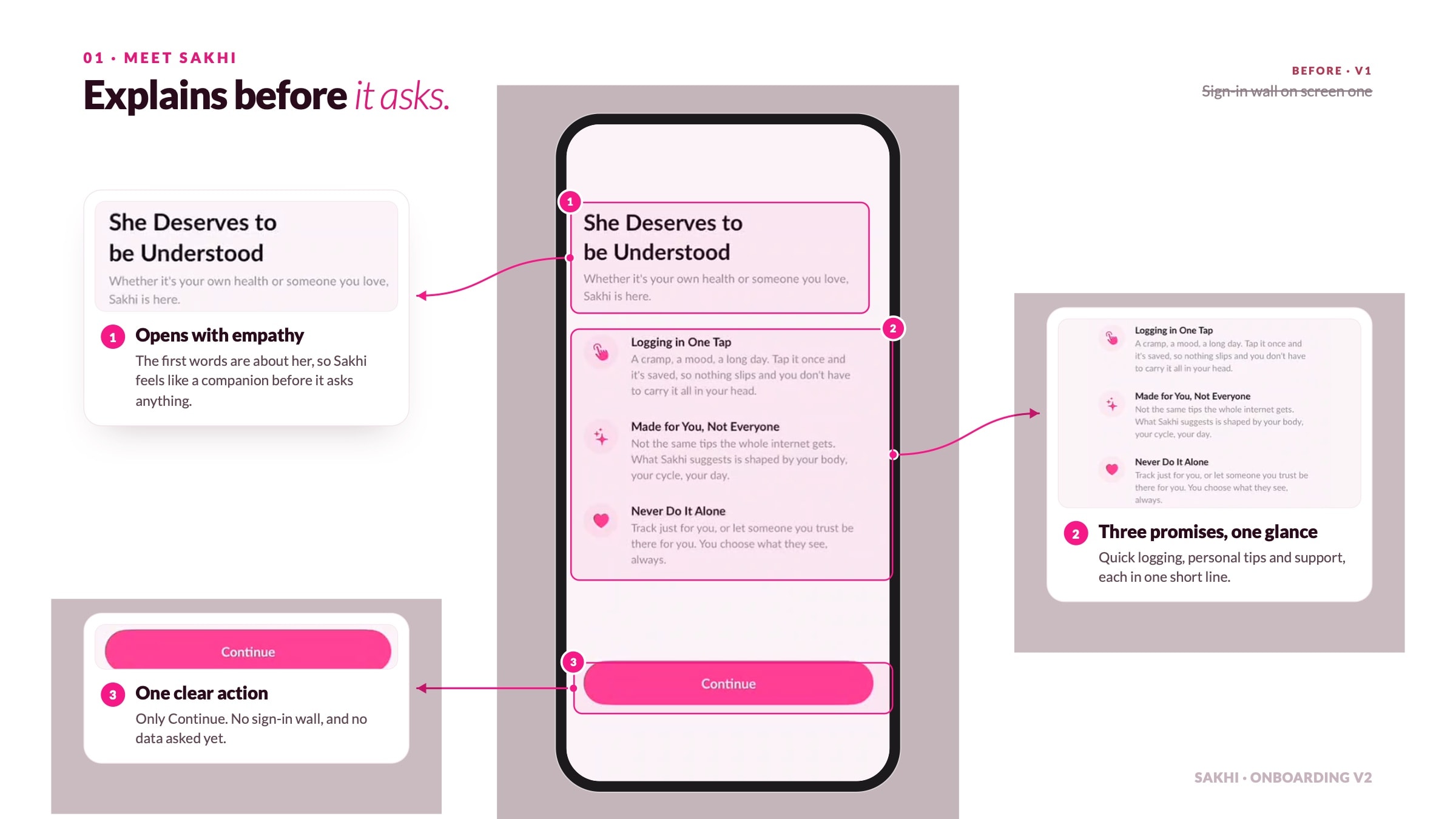
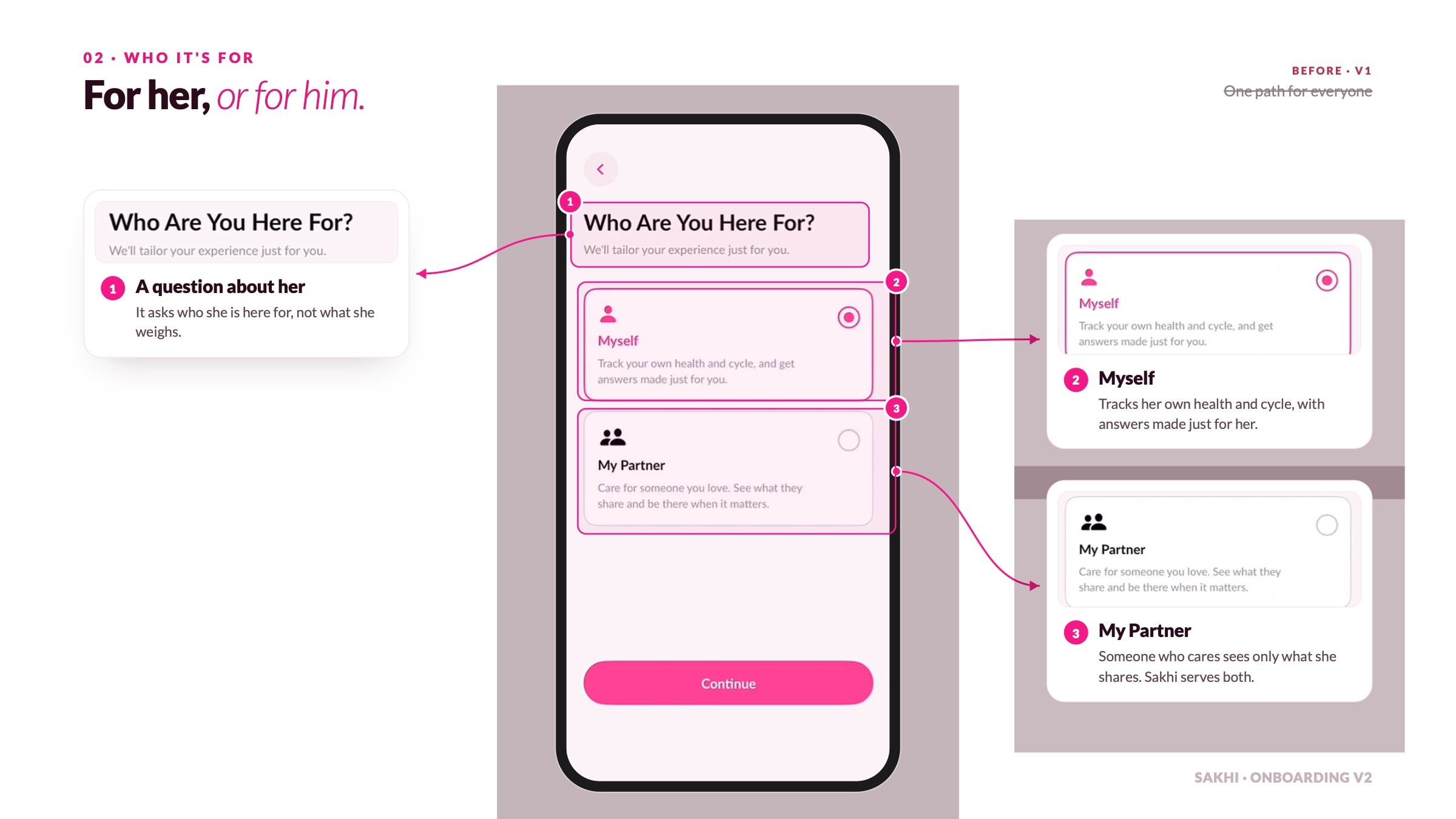
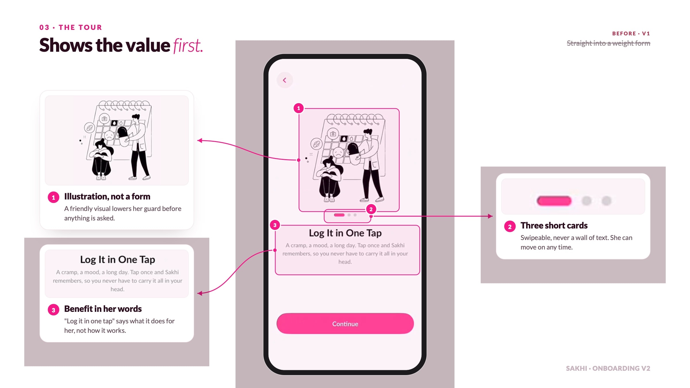
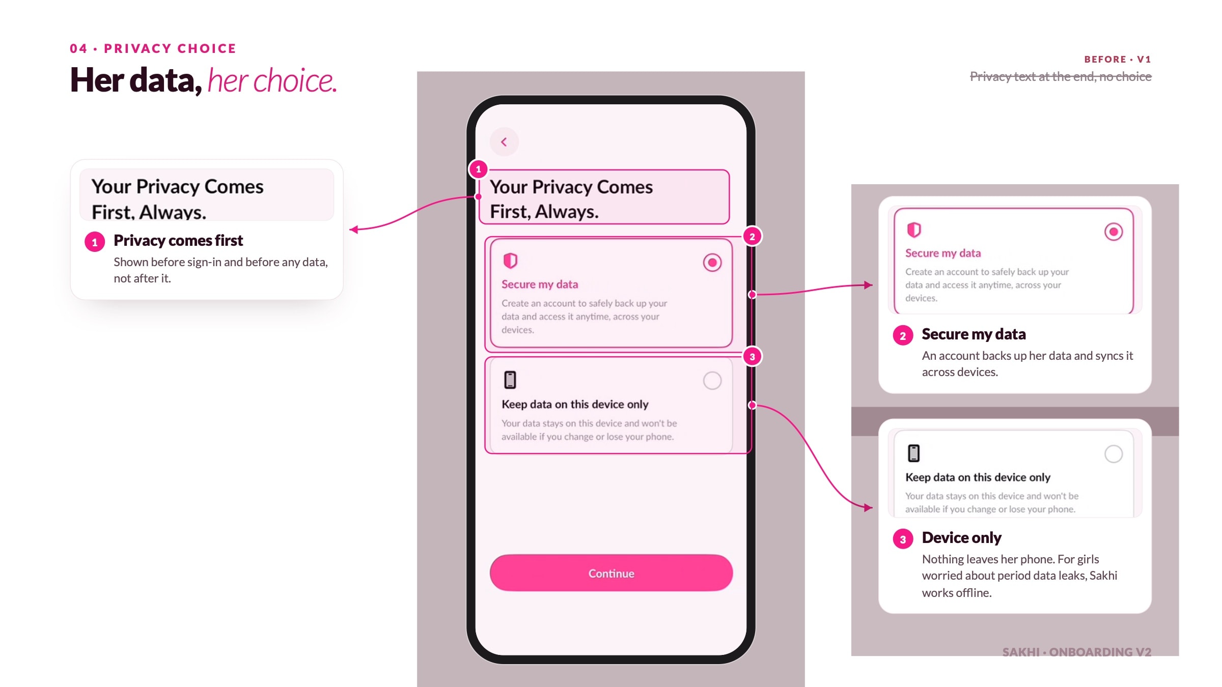
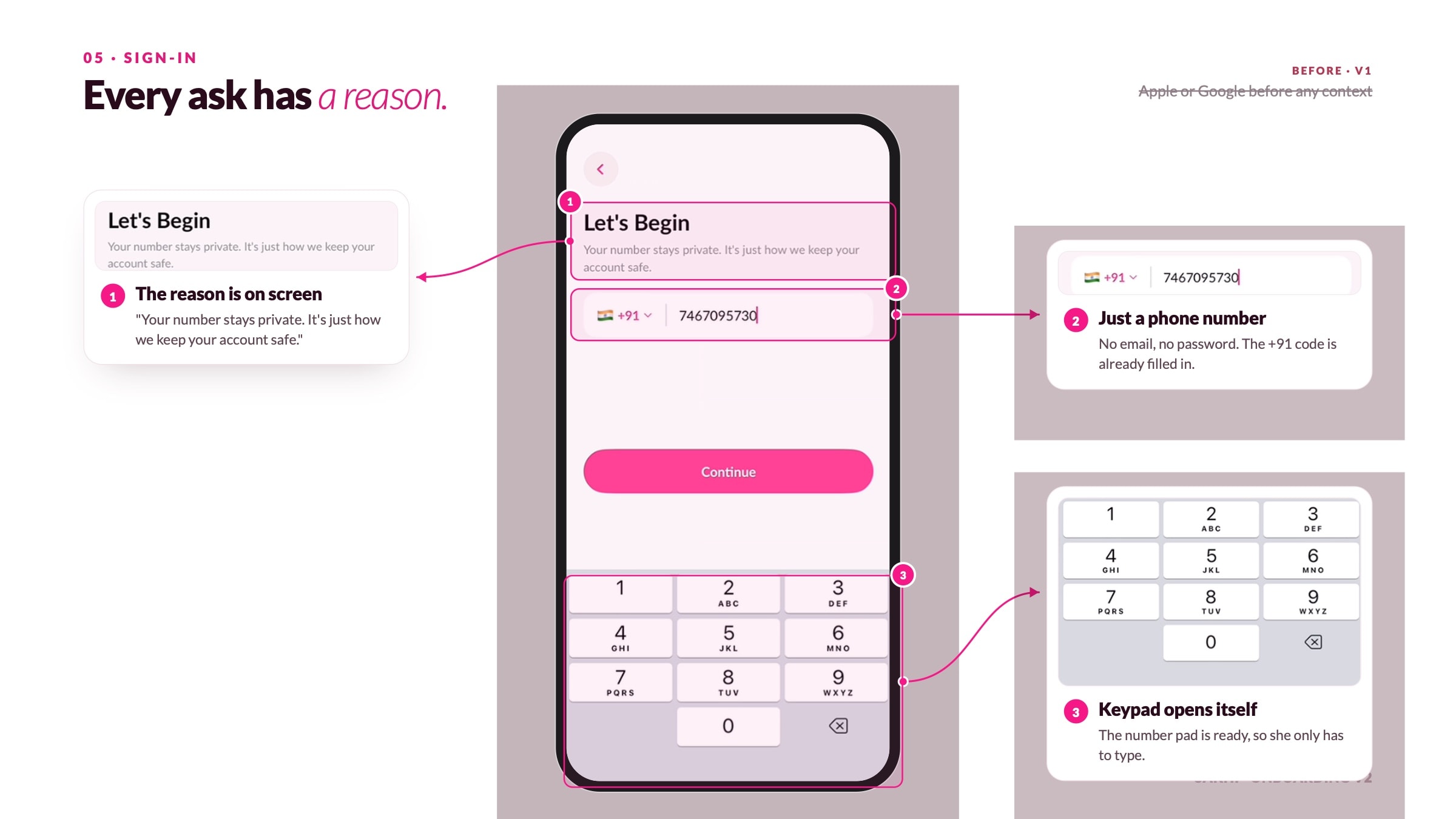
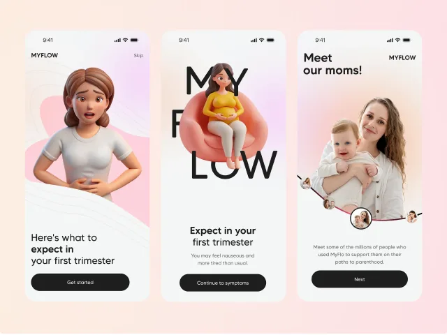
Onboarding justifies every question before she answers it, instead of collecting sensitive data on trust she hasn't given yet.
Interpretation
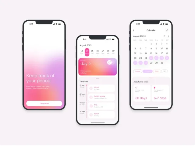
Patterns are calculated against her own history, so 'normal' finally means something specific rather than a population average.
The real goal
The app builds a gynae-ready report in the background, aimed at the 14.2% consultation rate rather than at daily engagement.
I was hired as the product designer for the next version, joining after launch - so the work began with understanding a shipped product and four years of decisions I wasn’t in the room for. I owned the design direction end to end: diagnosing the retention problem, then onboarding, the logging loop, insight delivery, and the doctor report - working against the team’s existing research archive and brand system rather than replacing them.
What I was designing against
0.0%
face period pain that disrupts the day
0.0%
handle it alone, with no help in the moment
0.0%
have ever consulted a doctor about it
0 mo
of logging before the app stops paying back
The scale of the problem is not in doubt, and it is not a rural or low-income story. It is the engineering student in Lucknow and the 20-year-old in a Pune hostel with an iPhone and 4G who has still never had a real conversation about her own body.
The silence is inherited, not chosen. The first period conversation happens between a mother and daughter, and what the daughter learns depends on what the mother was told - which was usually not much. School taught the diagrams and the Latin terms, not what to do when the cramps are bad enough that she cannot stand.
She didn’t churn loudly. She logged three months, learned nothing she didn’t already know, and quietly stopped opening the app - which is the same failure every tracker in this category has.
She logs diligently for weeks
Gets back a population average
Learns nothing about herself
Stops opening the app
Sakhi arrived with an unusually deep archive - 49 interviews segmented across five life stages, documented gynaecologist protocols, and competitor teardowns. My job wasn’t to redo it. It was to find where the shipped product had drifted from what the team already knew.
The archive segmented users by life stage - puberty, teen, reproductive, perimenopause, menopause. I focused on the two stages where the gap between what she feels and what she knows is widest, plus the person standing next to her who wants to help and can’t.
The most useful lines in the archive weren’t complaints about the app. They were the things she said about her own body - and what each one revealed about why a tracker was never going to be enough.
I just take a painkiller and go to college.
Reproductive age · 70.2% report day-disrupting pain
My mother said it's normal, so I never asked anyone.
Teen · silence passed down a generation
I didn't know that was something you could see a doctor about.
Only 14.2% have ever consulted about period pain
Coping was the failure - she had normalised a symptom worth investigating.
The knowledge gap is inherited, not chosen - the app has to teach without lecturing.
She wasn't avoiding the doctor - nobody had ever told her it warranted one.
Retention in this category collapses after the third cycle. Not because logging is hard, but because logging alone stops paying her back - she has entered her data for three months and learned nothing she did not already know.
Flo
Enormous content library and polished onboarding - but predictions run on population averages, not her own baseline
Scale + polishClue
Clinical, non-infantilising tone and strong data credibility - but reads cold, and never tells her what to do next
CredibilityMaya
Built for the Indian market with familiar language - but stops at tracking, with no path toward a doctor
Local fitGeneric trackers
Fast logging and calendar views - optimised for input speed, which is the one thing she does not actually want to do
Input-first
No competitor had solved the full picture. Flo has the scale and the content but speaks to a statistical average. Clue has the credibility but not the warmth. Maya has the local language but stops at the calendar. The pattern across all of them was the same gap: they tell her what is typical, never what is typical for her. The redesign didn’t try to out-feature any of them - it tried to answer the question none of them answered: after three months of logging, what does she actually know that she didn’t before?
Three separate failures kept pointing at the same root cause - the product was built to collect her data, not to give her back an understanding of it, and every competitor had made the same choice.
What she doesn’t say out loud
The interviews kept stalling on the same thing: the most important signals were the ones she would not volunteer. I treated each silence as a brief - if she won’t say it, the interface has to make it safe to say, or stop needing her to say it at all.
Each redaction lifts as it scrolls in - underneath is the decision it drove.
“I can’t stand up, but I’ll say I’m fine”
Ask about pain without it sounding like a complaint.
“I hide the app when someone walks past”
Discretion built into the interface, not buried in settings.
“I don’t know what’s normal for me”
Answered from her own history, not population averages.
“I’ll go to a doctor if it gets worse”
Points her toward the appointment, evidence in hand.
Her
She logged for three months and could still not answer whether her own cycle was normal - so she stopped, and the question stayed open for years.
The product
Optimising for daily logging kept her tapping without ever moving her toward the appointment that would actually change something.
The archive surfaced four recurring gaps - each one a place where she lost trust or lost interest. This section walks through how each was approached, from first attempt to current direction.
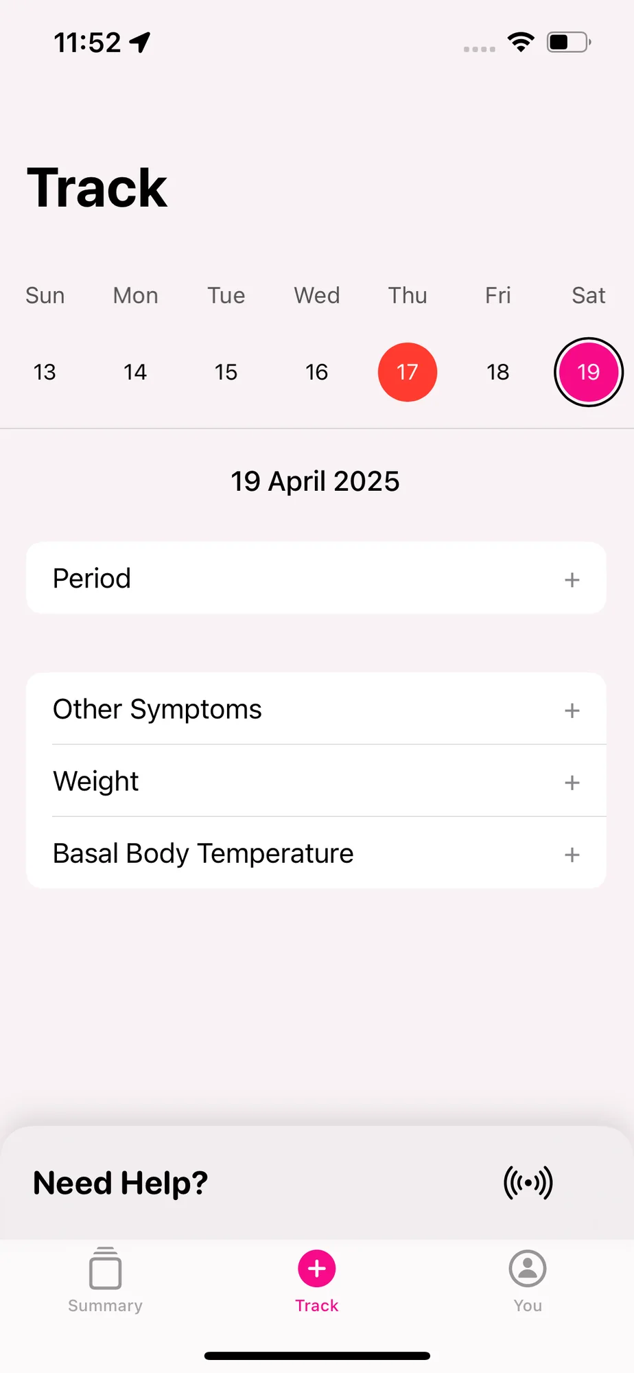
The shipped flow asked for name, age, PCOD symptoms, and average period length up front. Each question is reasonable in isolation. Together, on first open, they ask a woman who was taught not to discuss this to disclose all of it to an app she has no reason to trust yet.

Deferring every question until it was needed sounded right, but left the first session empty - she opens the app and it knows nothing, so it says nothing. The answer wasn’t fewer questions, it was questions that pay for themselves at the moment they’re asked.

Each question now carries a one-line reason for existing - not a privacy disclaimer, but what she gets in return for answering it.
Three questions, each justified inline, with everything else deferred to the moment it becomes relevant. Sensitive fields are explicitly skippable without dead-ending the flow.

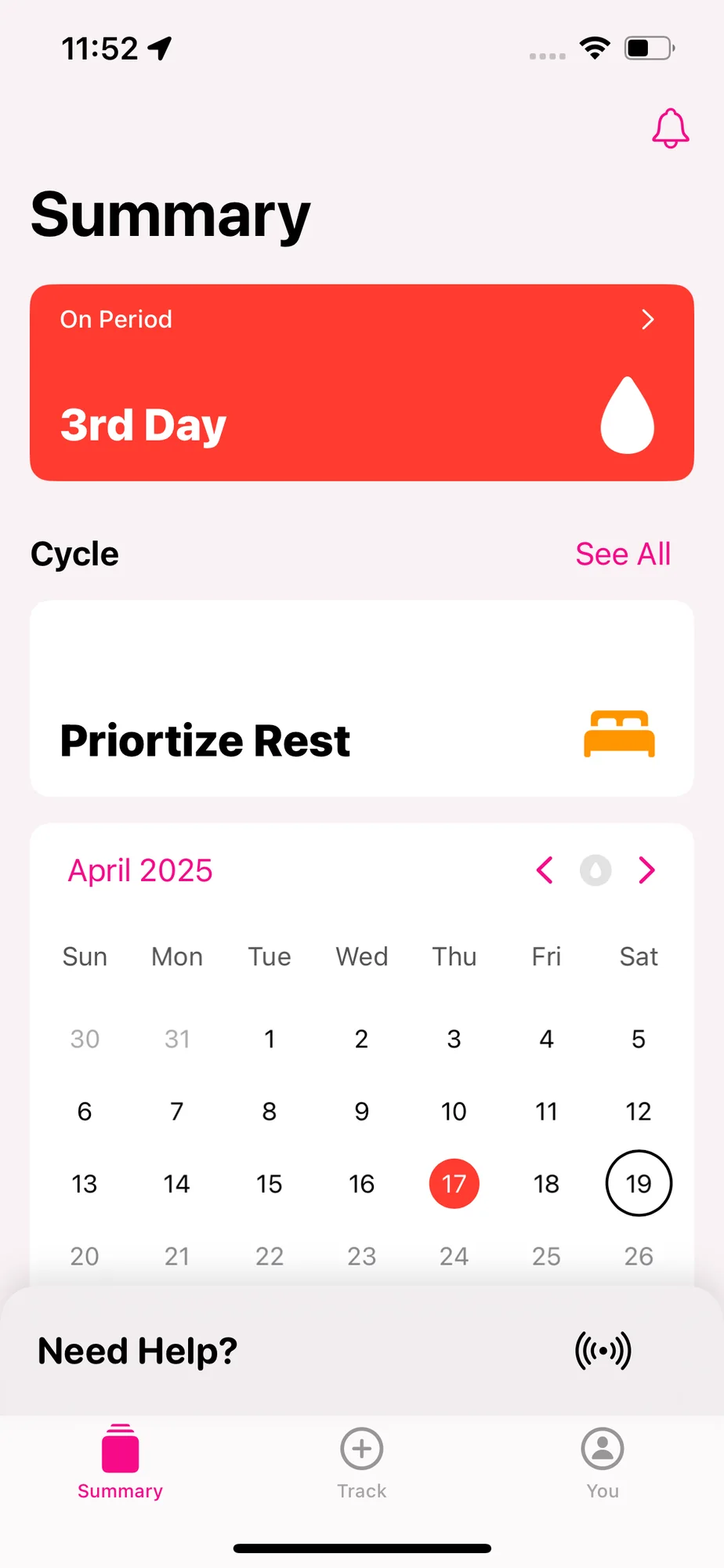
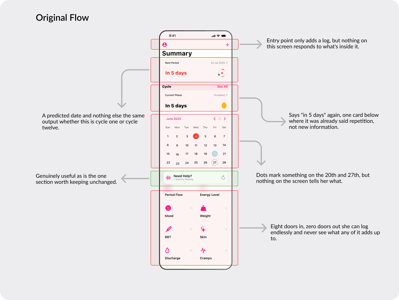
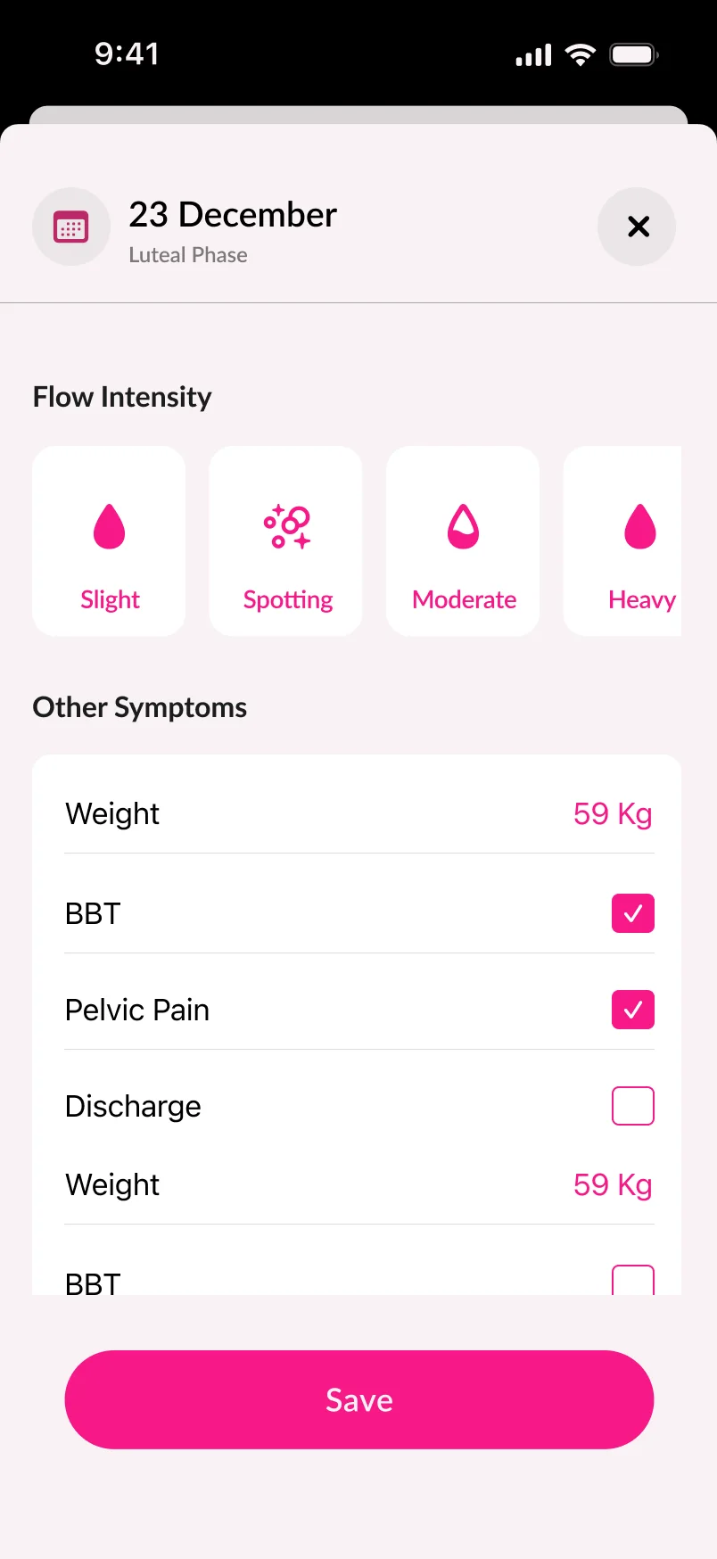
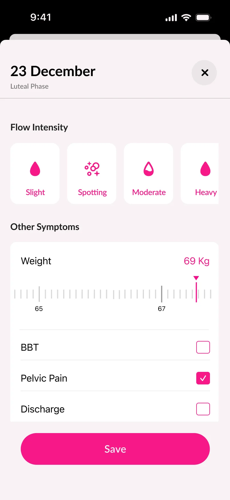
The logging loop worked exactly as designed - and that was the problem. She put data in every month and the app gave back a predicted date, which she could have estimated herself. The effort and the payoff were badly out of balance.
She has had painful, irregular cycles for two years. She opens the app each month, logs the day her period starts, and closes it. After three months she stops opening it.
Routes tried
How I approached the solution
I mapped the return on every log across the first six cycles and marked where it flatlined. It flatlined immediately - cycle one and cycle six produced identical output. That made the fix a data-interpretation question rather than a UI one.

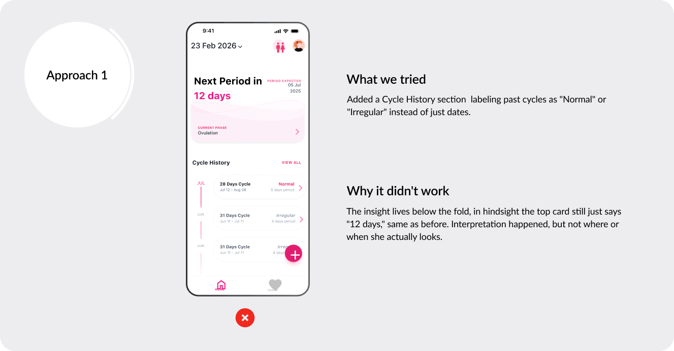
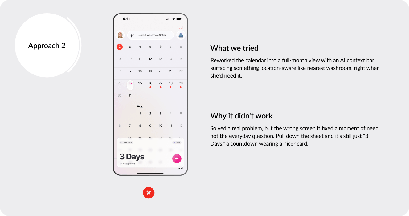
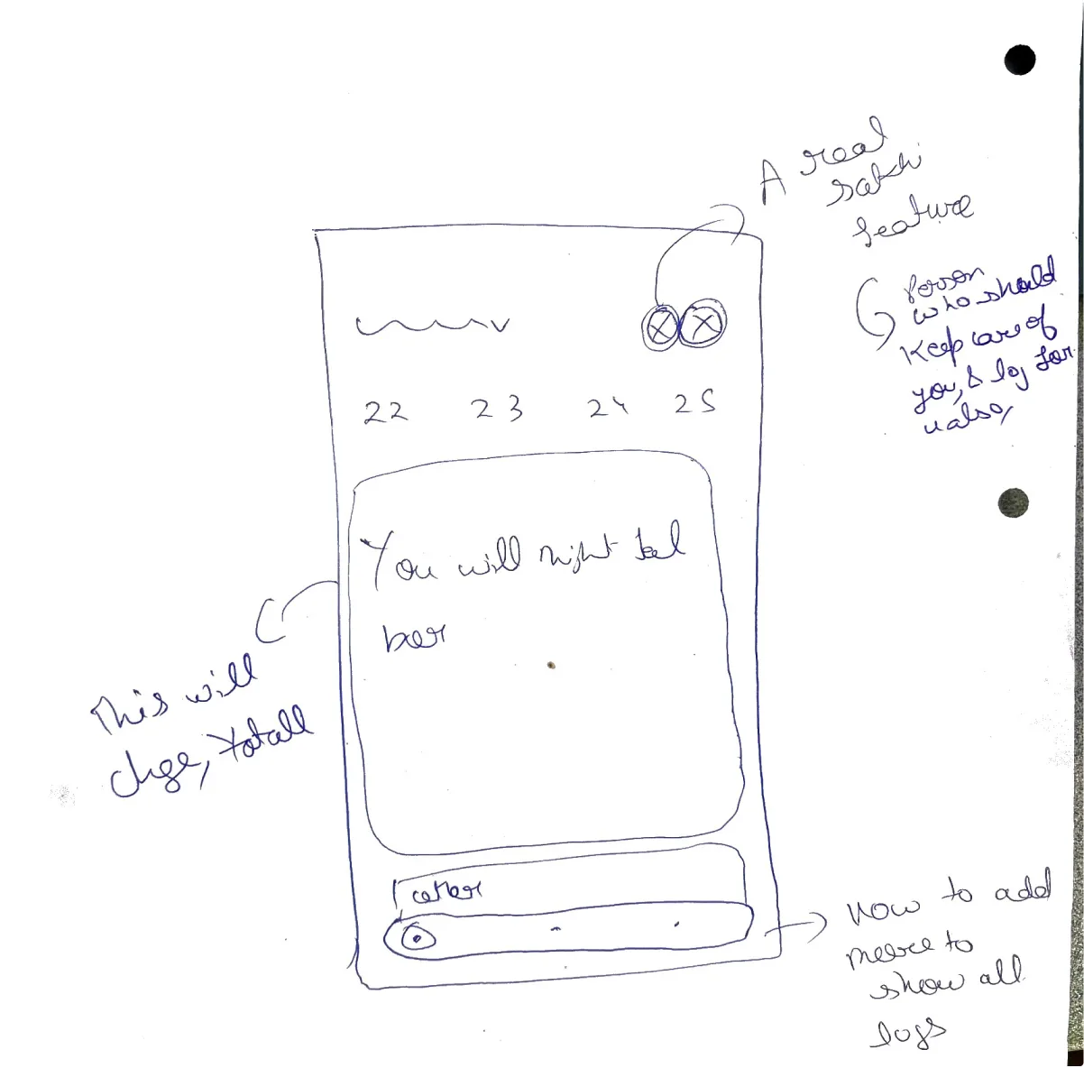
After understanding the problem, I tried different layouts to optimise for a better result.

That didn’t work out, so I tried another.

From each failure, I learned something.

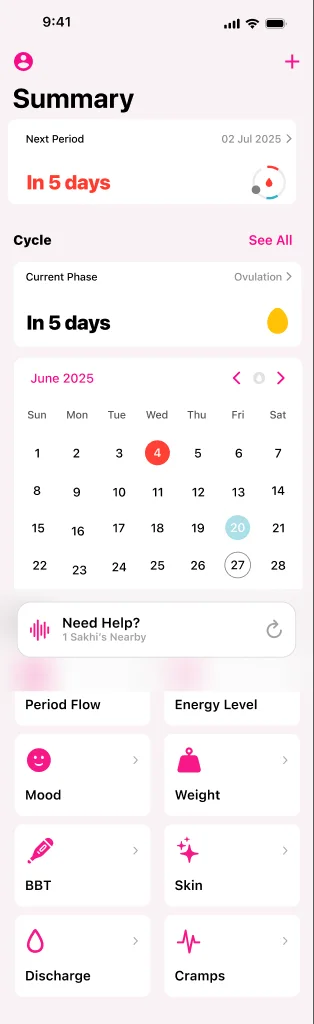
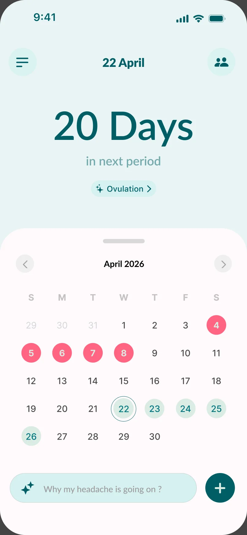
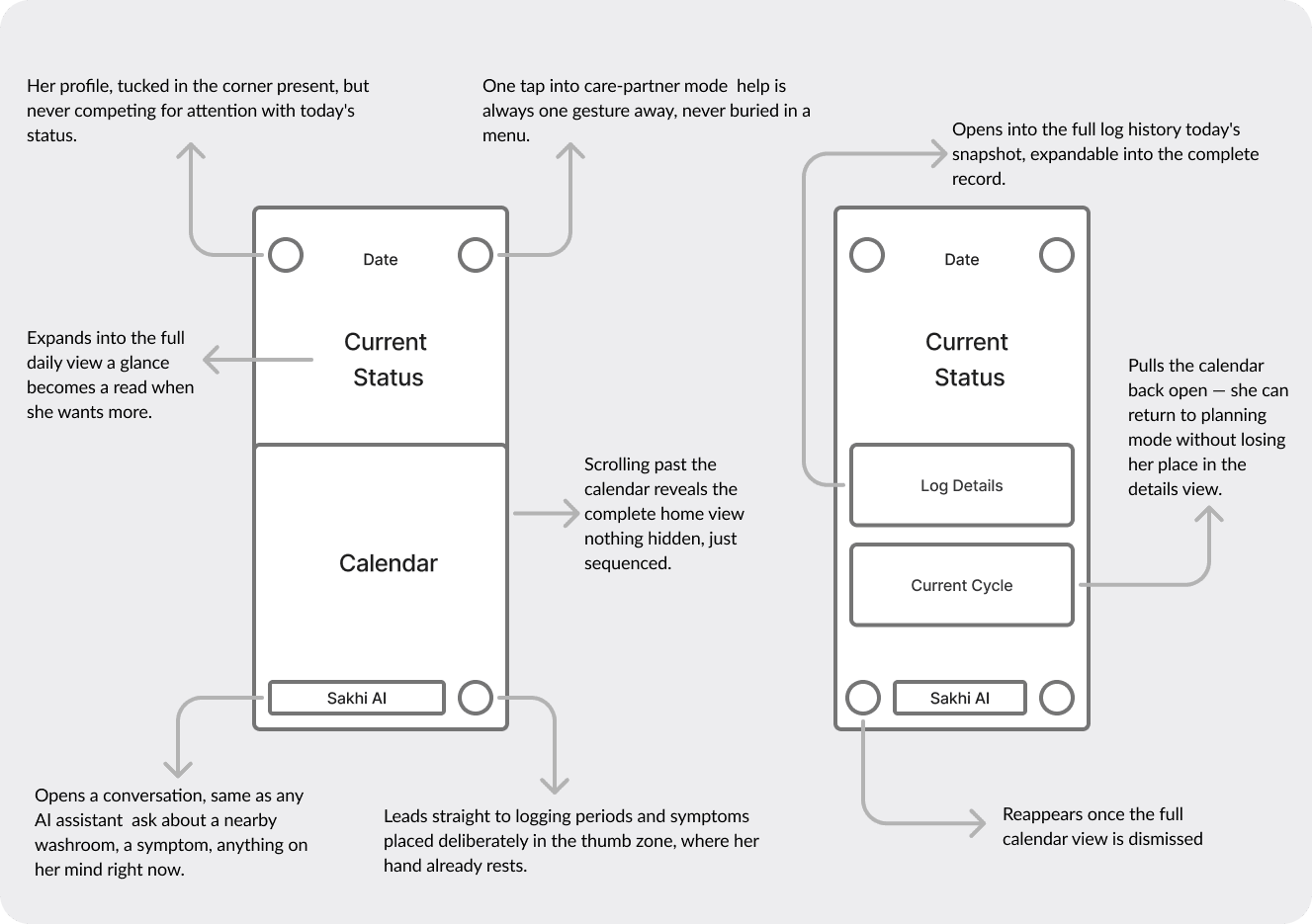
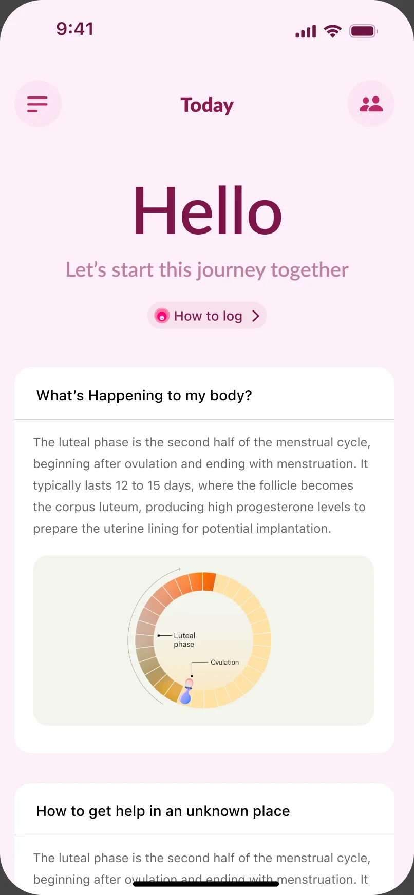
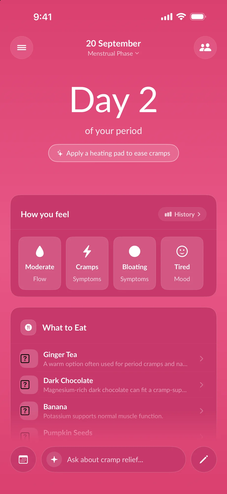
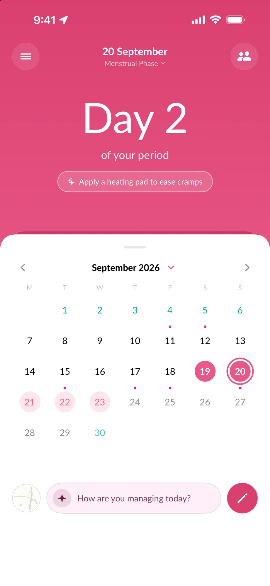
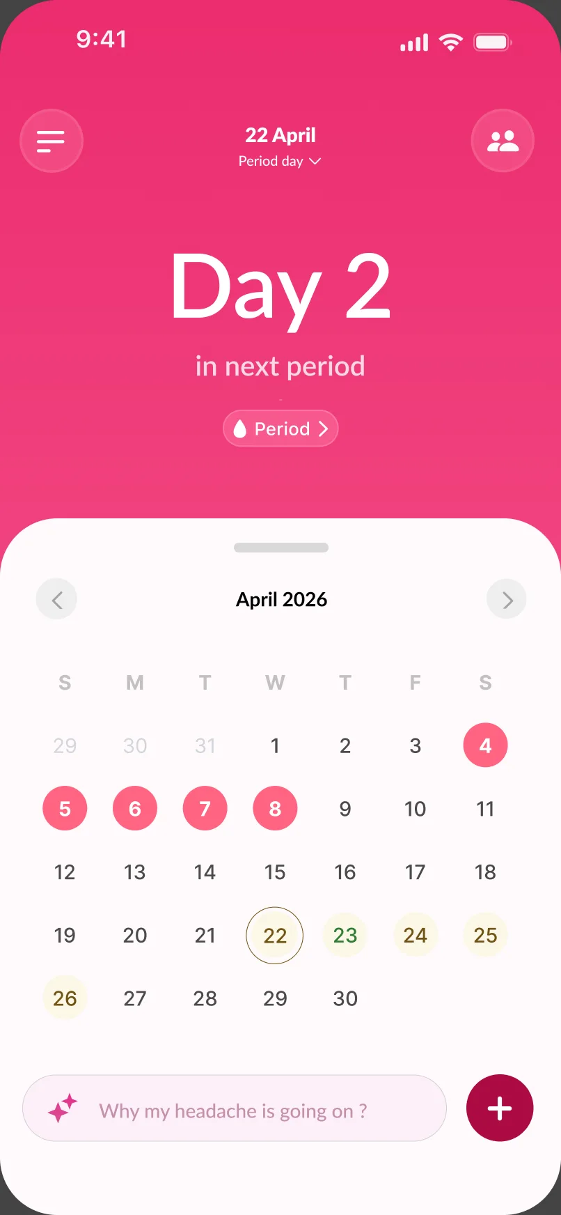
This architecture let me settle on a final layout and account for every condition the home screen needed to handle. Here’s where it landed.

Same user on the redesigned flow. Onboarding asks less and explains why. Each month returns something she didn't know, and by cycle three the app has enough to say something specific.
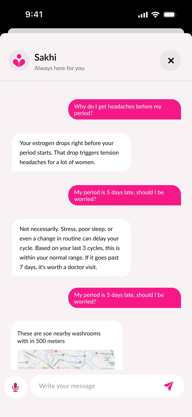
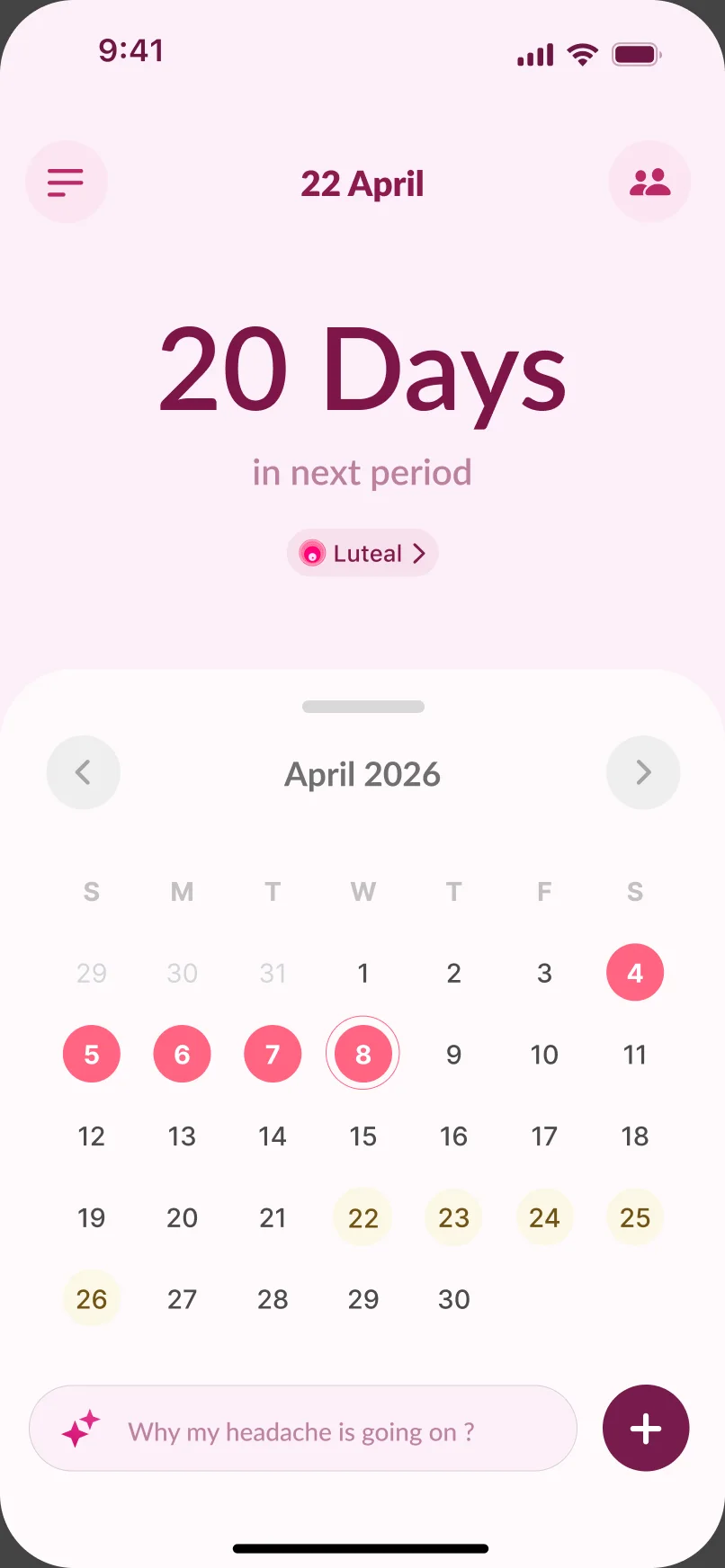
She doesn’t think in symptoms and categories - she thinks in questions. “Why do I get headaches before my period?” The old app had no place for that, so her actual question ended up typed into Google instead, outside the one app that already has her cycle history.

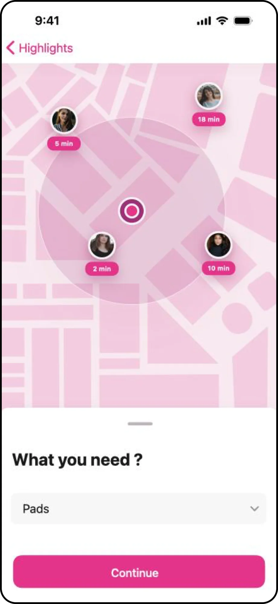
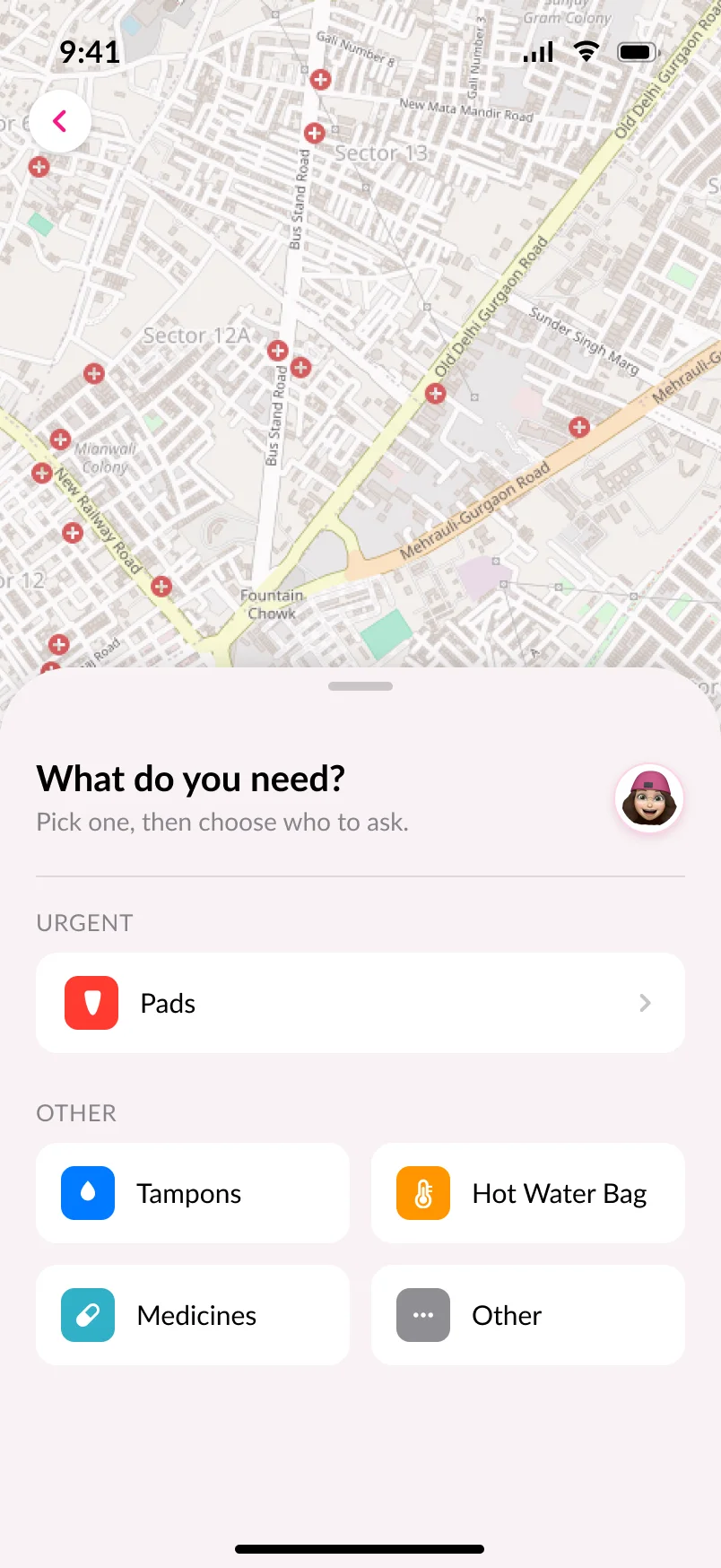
Questions get grounded answers tied to her own cycle, not generic internet text - “Your estrogen drops right before your period starts, that’s what’s triggering the headache.” When the question needs action, not just explanation, Sakhi surfaces nearby washrooms and medical stores directly in the chat. And when it needs more of her data to answer well, it asks right there in the conversation instead of sending her to a separate logging screen.

Impact
Not all of the work stayed on the board. The onboarding fix went live on the App Store during the contract; the deeper interpretation redesign is still in progress, so what follows covers only what actually shipped.
0+
active users on the live App Store app, after the overloaded onboarding screen became one clear, single-focus flow
Validation
Coming in after launch, I couldn’t validate on instinct - the team had four years of context I didn’t. Direction was reviewed against the existing research archive and walked through with the people who built and shipped the first version.
The most useful correction came out of those reviews: my first insight-delivery pattern was too clinical, and it broke the voice system’s core rule - Sakhi is a friend who noticed something, not a system raising a flag. That reframing changed the copy and the visual treatment together.
The onboarding fix shipped and is measured above. The deeper interpretation redesign has not shipped yet, so there are no outcome metrics for that part - anything else on this page would be a guess dressed as a result.
Looking back, the shifts that mattered weren’t new features - they were changing what the product was pointed at. A few takeaways from getting there.
There was a shipped product and a design lead before me. The work started with understanding why things were the way they were - not with a redesign.
I spent more time on the voice system than on layout. One badly-toned sentence during a health scare undoes every trust signal the visual design earned.
Sakhi's archive was better than most in-house teams have. The gap was that the shipped product hadn't yet caught up to what the team already knew.
Thanks for reading this far - I appreciate you taking the time to go through the whole case study. If you have questions or just want to chat about the process, feel free to reach out.