NT
๐Ÿ–ฅ๏ธ

Built for a bigger screen

This case study has detailed visuals, interactions, and layouts that are best experienced on a desktop or laptop.

โ† Back to portfolio

or rotate to landscape for a peek

Design System ยท AirIQ

One system.
Four products.

A token-first design system built from scratch alongside shipping product. No dedicated systems team. Just ruthless prioritisation, a shared Figma library, and the discipline to treat consistency as a feature.

Lead DesignerNov 2025 โ€“ Jan 2026Tokens ยท Components0 โ†’ 1
View in Figma โ†—Read case study โ†“
Design System overview
01

Why the system had to exist

Every product team was solving the same visual problem from scratch. Buttons with five different border radii. Three interpretations of the same status badge. Design inconsistency was slowing shipping velocity and eroding user trust.

0

Products sharing one Figma library

0

Core components, all states documented

0 weeks

From zero to v1, while shipping product

The constraint was the brief: no dedicated systems team, no runway to pause product work. The system had to be designed in the gaps, documented enough to survive handoff, opinionated enough to actually reduce decisions.

System architecture

Screens
SearchResultsBookingConfirm
Components
ButtonInputToggleDateTabsPagination
Foundation
ColorTypographySpacingGridIcons

Every screen assembles from components. Every component is built from foundation tokens. Change a token and the entire stack updates.

Approach

01

Token-first

Every colour, spacing step and shadow is a named token, not a hardcoded value. Swap the token, update every instance.

02

Component contracts

Each component ships with defined props, states and usage rules. No ambiguity in handoff.

03

Built while shipping

Tokens and components were introduced incrementally alongside real features, not in a silo.

04

Documentation as design

The Figma file is the doc. Annotations live inside the frames, not in a separate Notion page nobody reads.

02

Foundations

The pieces everything else is built on. Colour, type, spacing, grid, icons. Each defined once, referenced everywhere.

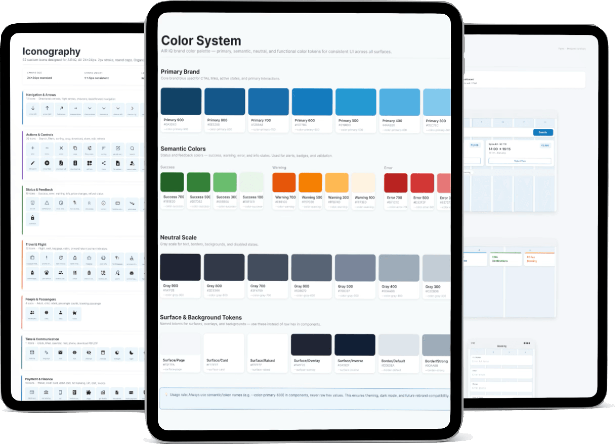
Color System

Decision: Colour tokens are split into three tiers: primitive (raw hex), semantic (intent-based), and component-specific. A single theme swap changes every surface without touching a component.

Token flow: tap a layer to trace the chain

โ†’
โ†’

Raw hex values live in the primitive layer. They are never used directly in components.

Why this decision

Why three token tiers instead of two?

One tier (primitives only) scatters raw hex values everywhere. Two tiers help intent but leave a gap at the component level. Three tiers mean a button's background is Button.bg, not #1076BC. When the brand updates, you update one primitive. Everything else follows automatically.

Typography

Decision: Two typefaces, one purpose each. Inter for UI density and readability, Lato for marketing weight. Nine named steps in the scale. Nothing ad hoc.

Why this decision

Why two typefaces instead of one?

Inter handles density. Long tables, dropdowns, small labels: it reads cleanly at 12px. Lato carries marketing weight. Headings, hero copy, onboarding: it adds warmth without softness. One typeface would either feel sterile in the UI or informal in the marketing layer.

Spacing & Shadow

Decision: An 8pt grid governs all spacing. Three shadow levels (resting, elevated, floating) map directly to depth intent, no decorative shadows.

Layout & Grid

Decision: 12-column fluid grid with defined breakpoints. Component-level responsive rules live inside components, not as page-level overrides.

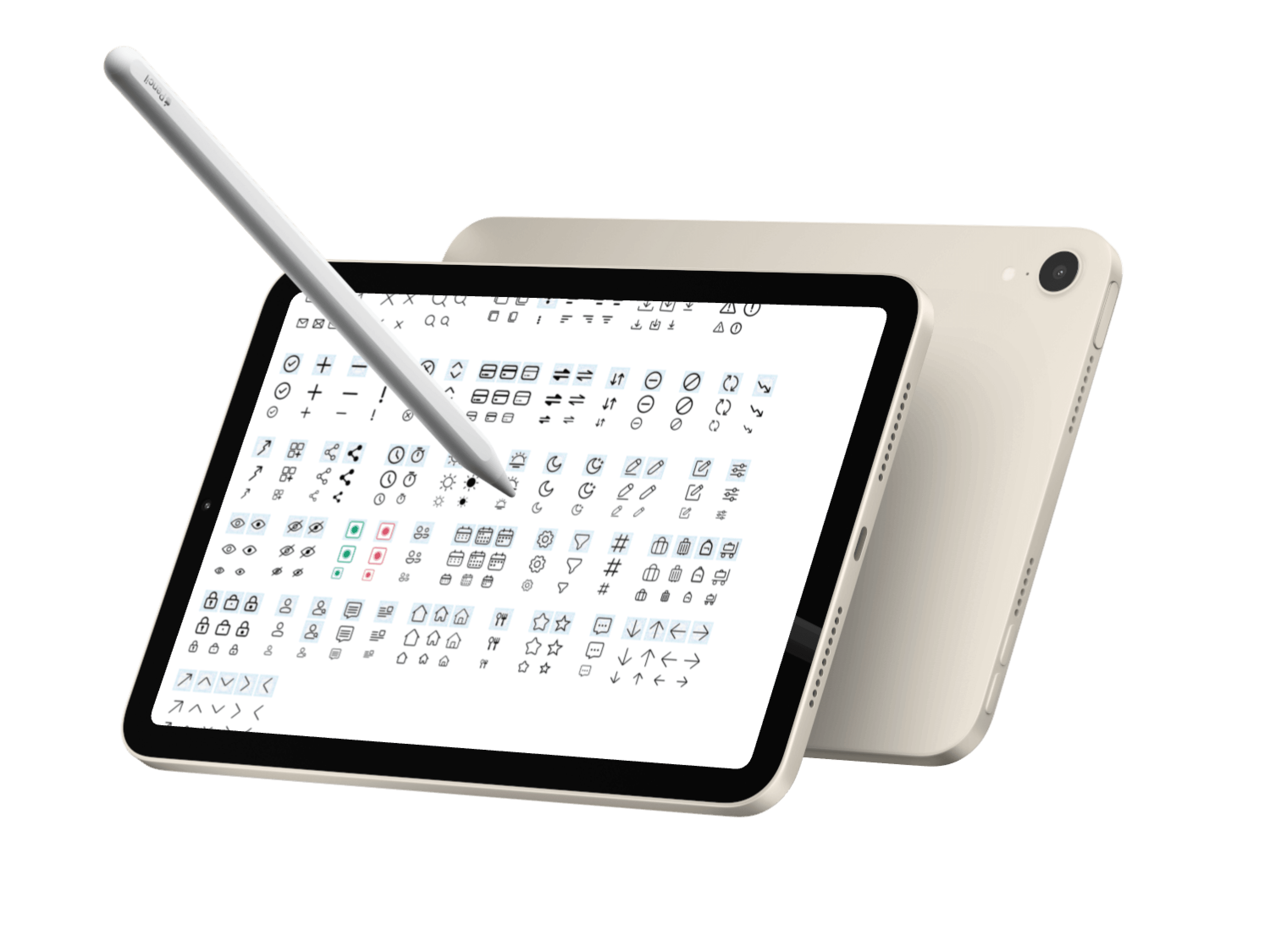
Iconography

Decision: A unified icon library at a single stroke weight. Every icon exports at 20 x 20 dp. Mixing icon styles is the fastest way to make a UI feel cheap. We did not.

03

Components

Every component is a decision made once. States, variants, and usage rules live in the Figma file, not in a separate doc that goes stale.

Why this decision

Why document every state in Figma, not just the default?

Handoff gaps live in the unstated. If hover is not designed, engineering invents it. If loading is not specified, it gets cut. Documenting every state per component upfront costs hours. Fixing state inconsistencies in production costs weeks.

Buttons

Four variants: primary, secondary, tertiary, ghost. Every state (hover, active, loading, disabled) is documented. No one-off button styles.

Input Fields

Seven states, three sizes. Error and helper text are part of the component, not added as detached text layers in handoff.

Checkbox, Radio & Toggle

Selection controls share a consistent spatial rhythm. Indeterminate state is explicitly handled, a gap most teams discover in production.

Dropdown & Select

Multi-select, single-select, searchable variants. The dropdown inherits the input field anatomy: same tokens, same spacing.

Tabs & Navigation

Line and pill variants. Active state uses the accent token. Swap the theme and every tab updates.

Pagination

Compact pagination with explicit page controls and item-count feedback. Sized to sit quietly inside dense data tables.

Date & Time Picker

Travel-critical component. Ships with range selection, blocked-date states, and a time picker, the most-requested component in v1.

04

In the wild

The system only matters if it shows up in production. Here is how foundations and components assemble into the AirIQ booking flow.

Search

Date picker, passenger selector, airport autocomplete, all system components. The booking entry point assembles in half the time it used to.

Results

Status badges (Direct / Economy / Delayed) are tokens. Grid rhythm is the layout system. Sorting controls use Dropdown. Zero custom overrides.

Booking

The traveller detail form is Input, Dropdown and Checkbox in sequence. One component library, one form, consistent across every device width.

Confirmation

Typography scale and colour tokens carry the hierarchy. The success state reuses the same Badge component as elsewhere. Semantic colour, different meaning.

The question I asked for every AirIQ screen: "Is this a component or a custom?" If it needed to be custom, that was a signal the system had a gap. I plugged it.

Consistency as trust

Agents booking 25k tickets a day cannot afford to re-learn a UI pattern. Every familiar component reduces cognitive load.

Speed through reuse

The entire booking confirmation screen was assembled from existing components in under two hours. That speed compounds.

System as culture

A design system is only as strong as the habit of using it. Annotations inside Figma frames made adoption frictionless.

05

Impact

A design system is not just a deliverable. It is a multiplier. These are the results after three months in production.

Without the system vs. with the system

Before

5+ button styles across product screens

Ad hoc spacing. Every designer eyeballed it.

Icon library split across three Figma files

No documented component states

Onboarding new designers took 2+ weeks

After

4 button variants, every state documented

8pt grid enforced via auto-layout

Unified icon library, one stroke weight

States and usage rules live inside components

New designers contribute by day 3

0%

Faster screen assembly

for screens built entirely from library components

0 weeks

From 0 to v1

while simultaneously shipping product

Adoption beats perfection

A system no one uses is a system that does not exist. I shipped an imperfect v1 fast, then iterated based on real usage, not theoretical completeness.

Tokens are the real leverage

Components can be rebuilt. Tokens are load-bearing. Getting naming conventions and tier structure right early saved weeks of migration work later.