Project Overview
End-to-end solo. Research to tested prototype.
Everything from screener survey to two rounds of usability testing. One designer, four weeks.
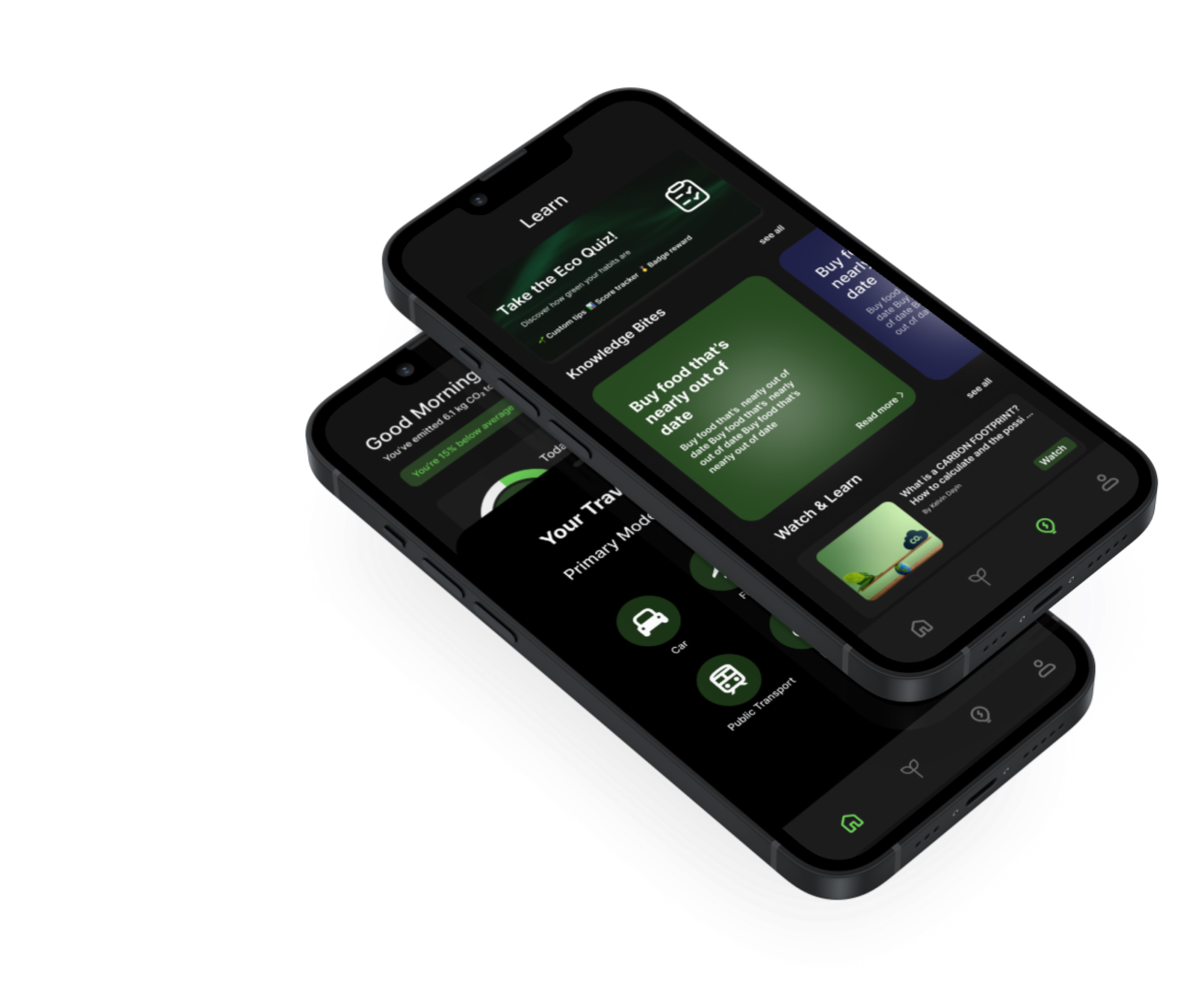
Daily Footprint Tracking
Quick-log from home. Every extra tap was a reason to quit.
Impact Visualization
Raw CO₂ numbers reframed as plain-language comparisons.
Learning Hub
Education as context, not a tab.
Progress Profile
Added after every tester asked “am I getting better?”
The Problem
Why motivated users still quit eco apps.
“I opened Joro once, saw my score, felt terrible, and deleted it. I wasn't looking for a report card.”
Interview participant, 26, product manager
Project Constraints
iOS concept only
No backend. Carbon estimates are averaged. Approximate over complex.
Scope: daily habits
Offsets, social, leaderboards cut. The core loop had to work first.
4-week sprint
Self-imposed deadline forced real prioritisation.
No longitudinal data
Insights from 45-minute sessions, not observed behaviour over time.
Before designing anything, I needed to understand this problem through the people feeling it — not through assumptions.
Design Thinking Process
Five phases.
Double-diamond. The Define phase upended my assumptions entirely.
only one went as planned.
01
Empathize
02
Define
03
Ideate
04
Prototype
05
Test
5 semi-structured interviews + a 12-person screener survey. I recruited people who identified as eco-conscious but inconsistent, not existing eco-app users.
Synthesised 30+ raw findings into one framing: users don't abandon eco apps because they don't care. They quit because tracking makes them feel worse, not better.
pivot pointListed 23 possible features, then cut to 5 using one filter: can a first-time user do this on day one without help? If not, it's out of V1.
Mid-fi first to validate IA and flow, then hi-fi to test visual decisions. Ran usability tests between both rounds, not just at the end.
Two rounds with 5 participants each. Round 2 tested the specific changes identified in Round 1, not a general re-test of the whole prototype.
The double-diamond looked tidy on paper. The Define phase is where assumptions broke down — and the real problem surfaced.
User Research
What I expected to find. What I actually found.
I recruited people who described themselves as eco-conscious but inconsistent. Not existing app users.
0%
said existing apps made them feel judged, not helped
0+
semi-structured interviews, 30 min each
0/5
interviewees had uninstalled an eco app within 10 days
Finding → Design decision
🔍 3/5 had quit an app within the first 10 days
✓ First-time logging became the primary design problem. Not the dashboard.
🔍 No one wanted to manually log food in detail
✓ Quick-select cards replace free-form input. Speed over completeness.
🔍 Every extra navigation step caused 1–2 testers to abandon the task
✓ Log without leaving home screen. The FAB exists because of this single observation.
Those findings had faces. Two archetypes turned raw data into design decisions.
Audience & Personas
Three segments. Two design lenses.
Research defined who I was designing for. Two personas made that concrete.
Eco-Curious Beginner
Cares but overwhelmed. Needs wins, not warnings.
Active Eco-Enthusiast
Built habits already. Wants proof they matter.
Lapsed Eco-App User
Burned by guilt-driven data. Trust is the entry point.
Two archetypes shaped every screen


With the audience defined, I audited what already existed — and studied the moment users stopped wanting to open each app.
Competitor Analysis
What each app taught me. And what changed.
I used each app for 2 to 3 days. I paid attention to the moment I stopped wanting to open it.
The audit wasn't inspiration — it was permission to make hard, explicit rejections in every design choice that followed.
Colors & Typography
Every decision had an alternative I chose not to use.
Design choices are easier to evaluate when you know what was rejected.
Colour decision
Tested 3 green values. Lime-green was too optimistic, celebrating before the user did anything. Forest green felt preachy. #2D7D43 sits between: calm, credible, grown-up.
Primary
#2D7D43
Accent · CTA
Secondary
#48A362
Charts
Surface
#E8F7EC
Card tints
Dark BG
#0A1F0F
Hero
Ink
#111827
Headings
Muted
#6B7280
Body copy
Typeface decision
DM Sans
RejectedToo friendly. Wrong register for a data tool.
Nunito
RejectedRounded terminals looked playful at small sizes.
Inter
ChosenTrustworthy, data-appropriate, excellent at every weight.
Bold
700 · Headings
Medium
500 · Labels
Regular
400 · Body
Light
300 · Captions
Visual language locked. Next: structure — and the first brutal cuts.
Mid-Fidelity Wireframes
IA first. Screens second.
One filter: can a first-time user complete this on day one? Everything that failed the filter was cut.
23
ideas
12
kept
Failed the day-one filter
Social sharing & leaderboards
Carbon offset purchases
Lifecycle analysis
Streak mechanics
Friend comparisons
Batch import from bank
Detailed food calculations
Export to CSV
Custom notification rules
In-app community
Carbon offsetting marketplace
Home Dashboard
Activity Log

Carbon Detail
Add Activity
Quick Log
Learning Hub
Learn Detail
Progress View
Weekly Chart
Profile & Goals
Onboarding
Permissions
The skeleton held. The question was whether first-time users could actually navigate it.
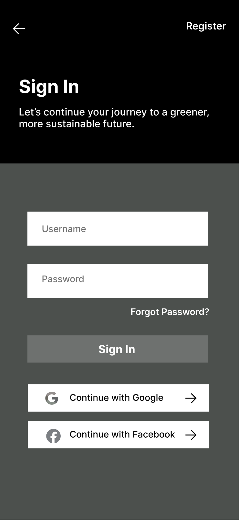
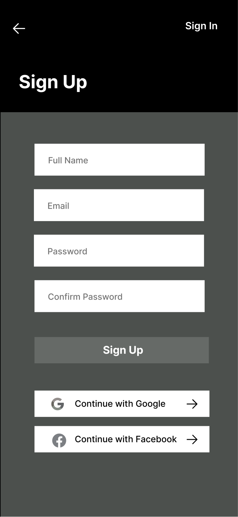
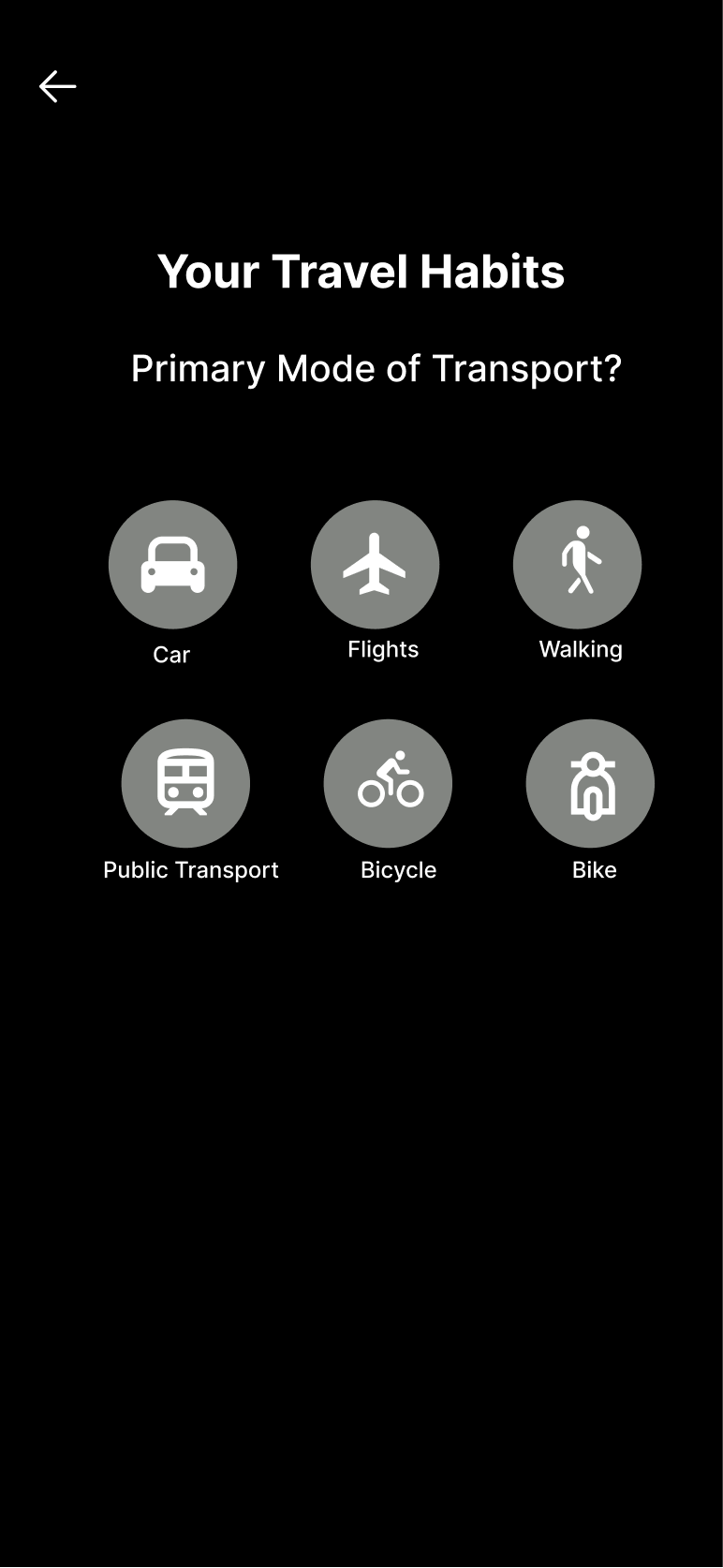
High Fidelity: OnBoarding
Nine screens. One commitment at a time.
V1 asked for too much before showing any value. 2 testers dropped off before setup was complete. V2 earns trust first, then asks.
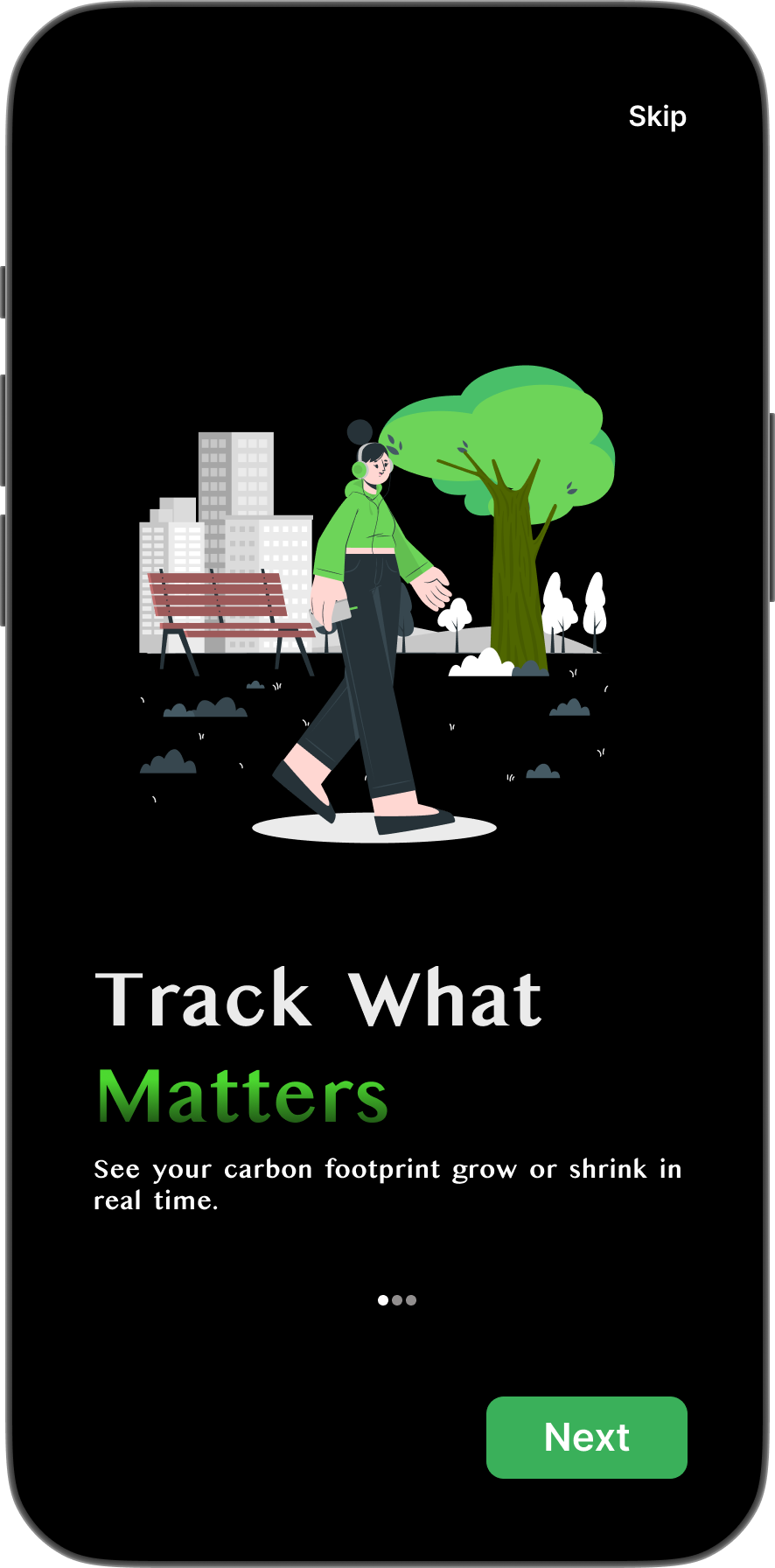
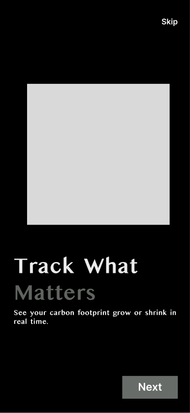
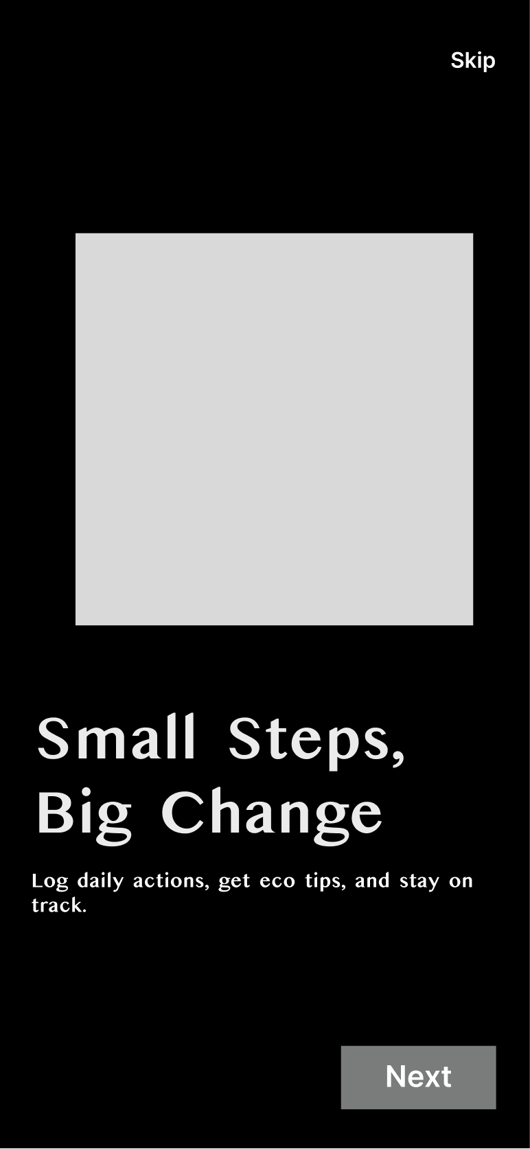
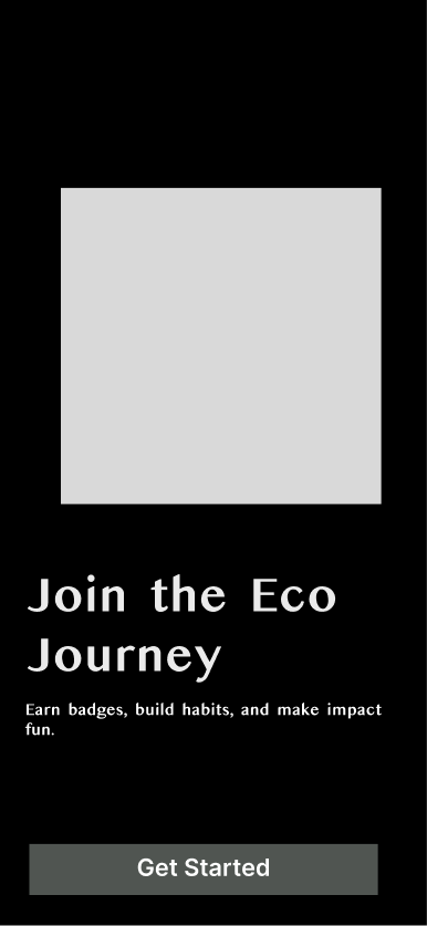
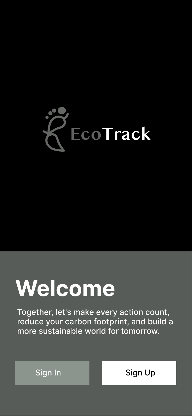
Splash
EcoTrack logo
Track What Matters
See your footprint in real time
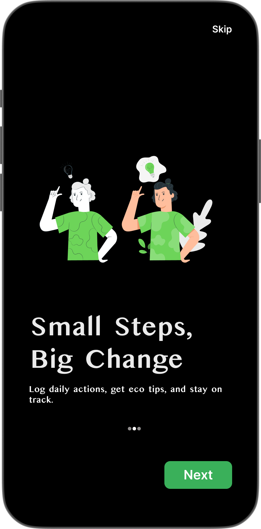
Small Steps, Big Change
Log daily actions, get eco tips
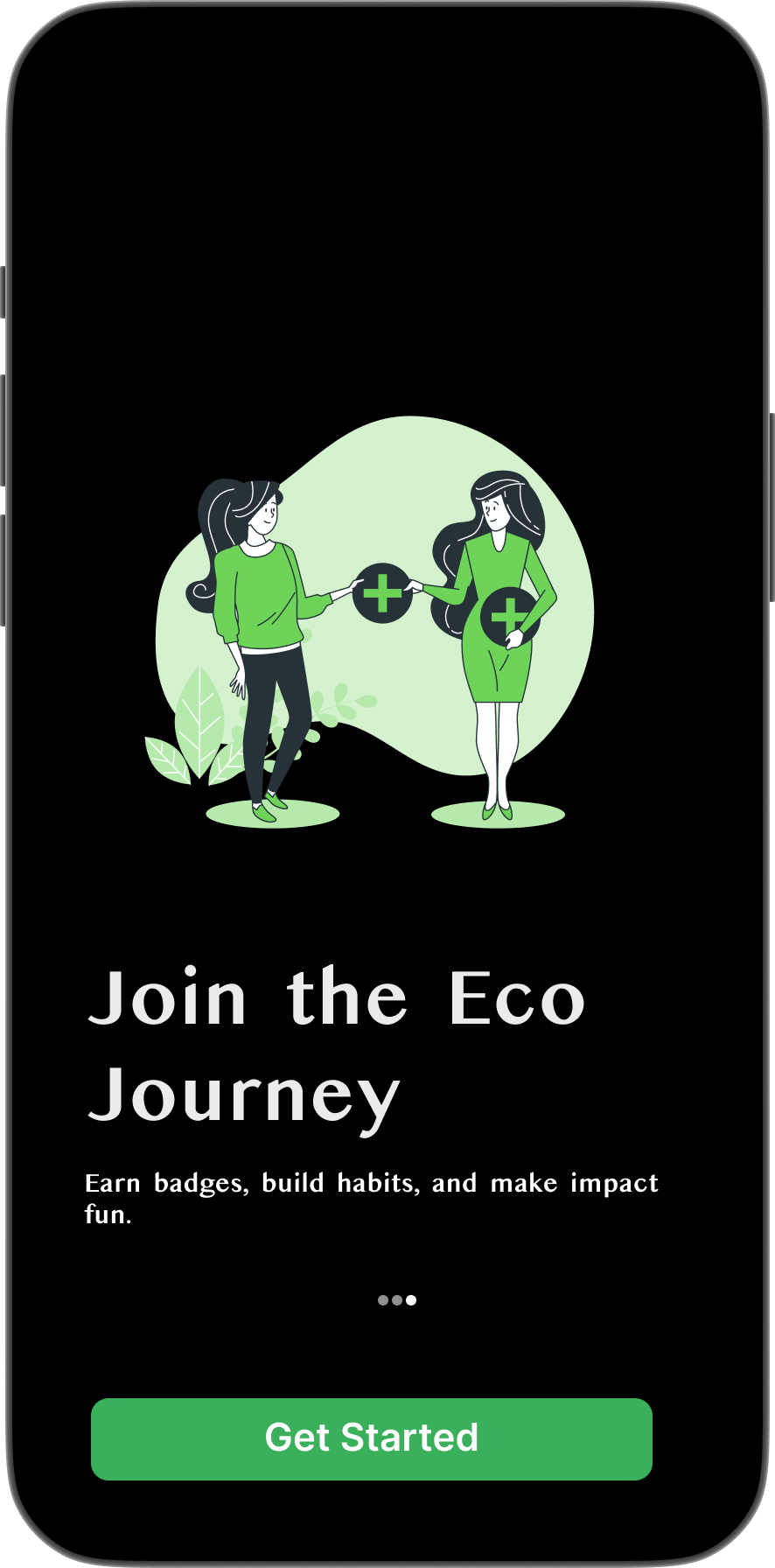
Join the Eco Journey
Earn badges, build habits
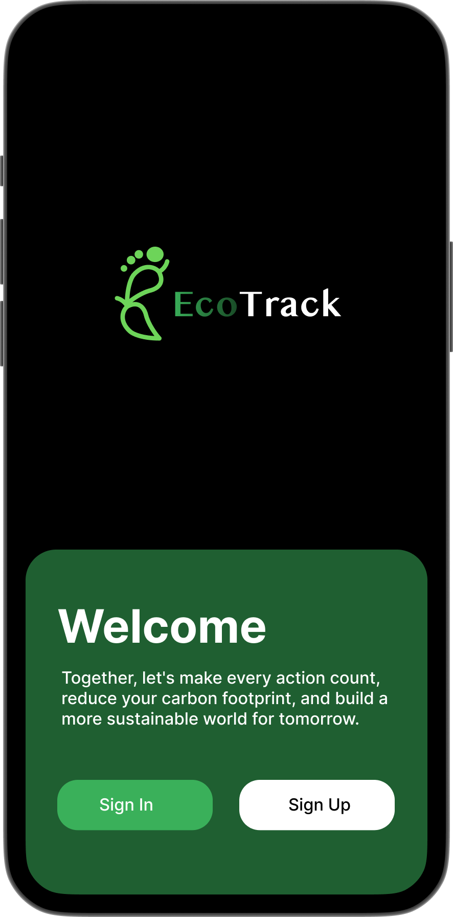
Welcome
Sign In / Sign Up
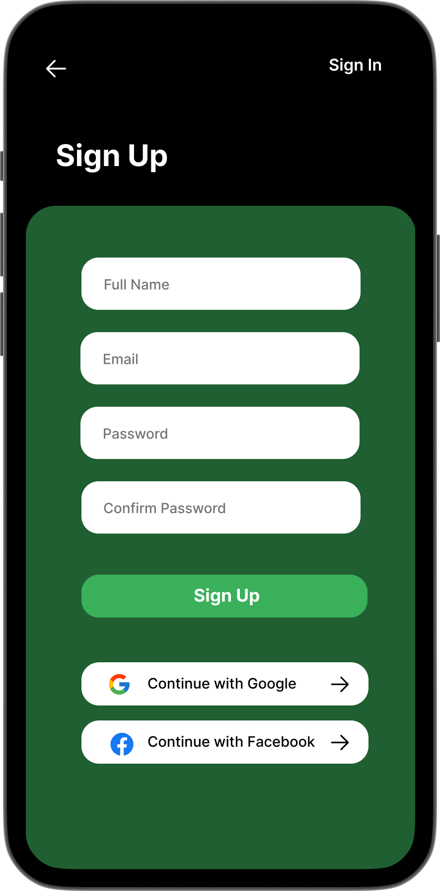
Sign Up
Name · Email · Password
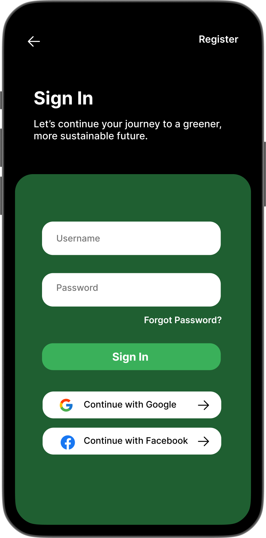
Sign In
"Let's continue your journey."
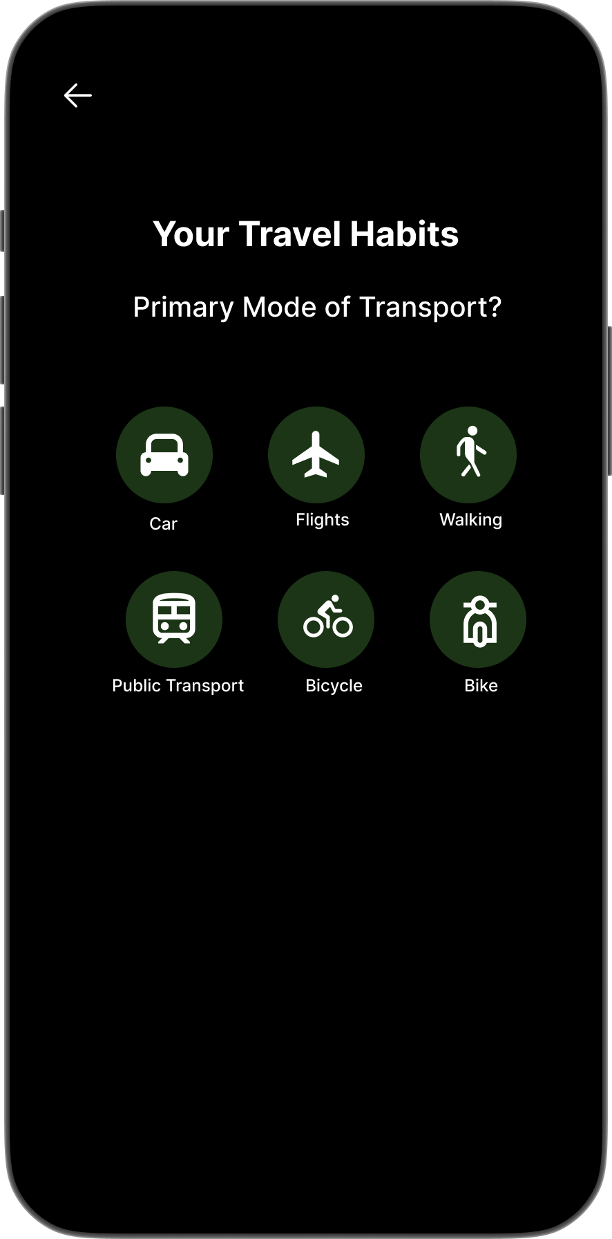
Your Travel Habits
Car · Flights · Walking · Public Transport · Bicycle
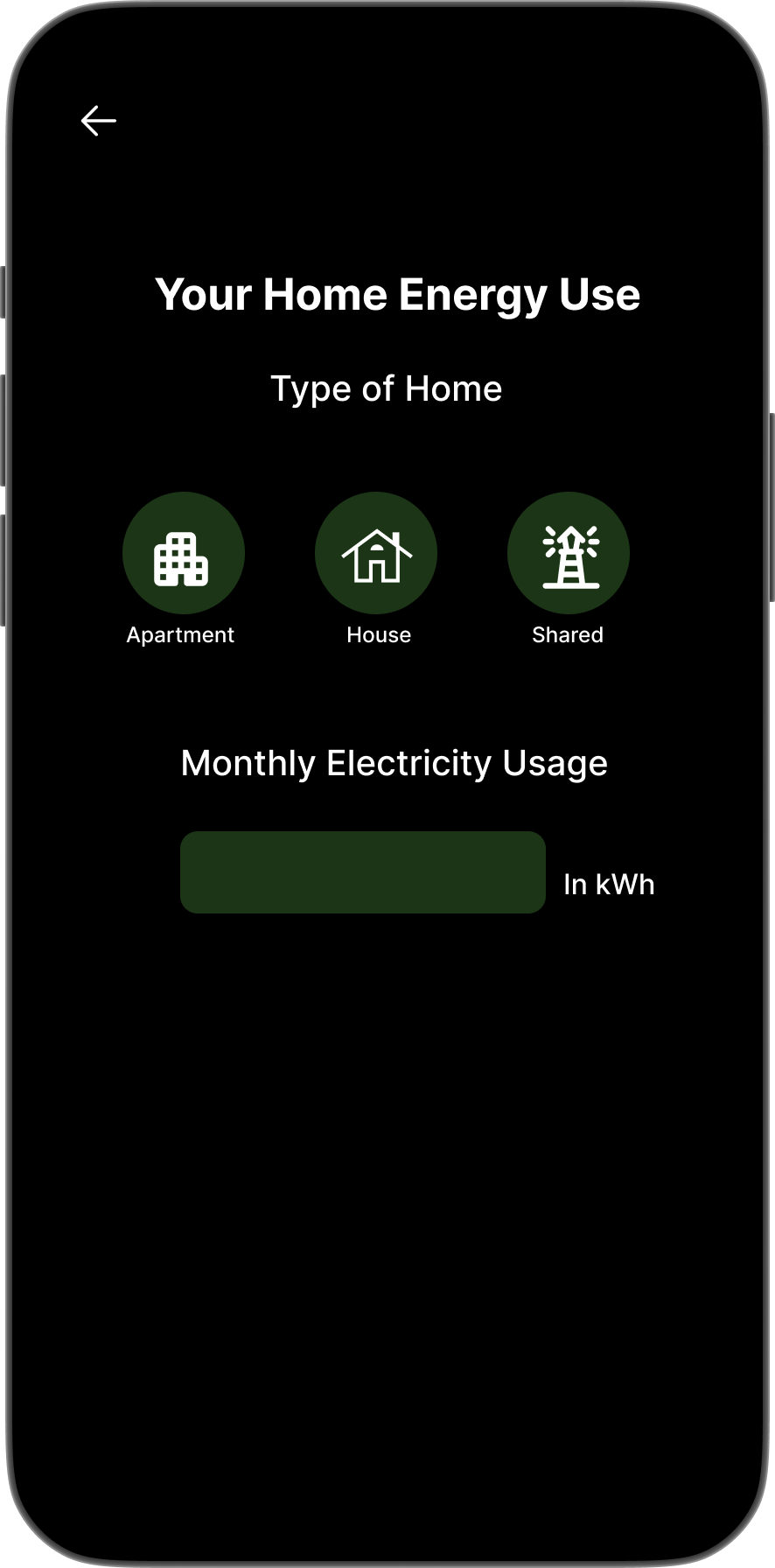
Your Home Energy Use
Apartment · House · Shared · Monthly kWh
What changed in V2
What V1 got wrong
Onboarding earns entry. The core screens have to sustain it.
High Fidelity: Core App Screens
Five views. One coherent system.
Each screen answers one question without requiring the user to navigate away.
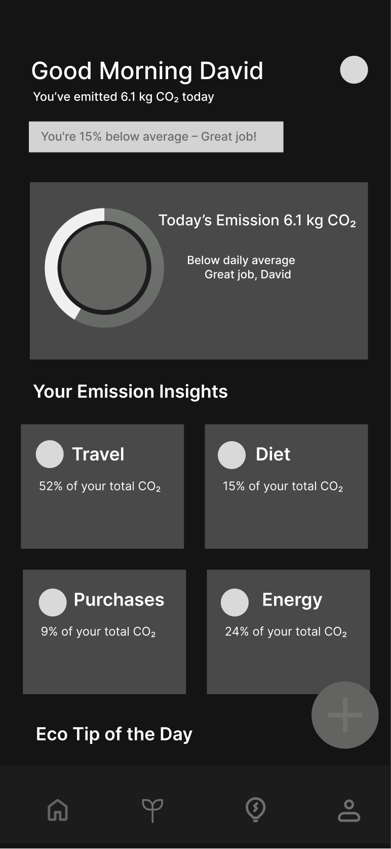
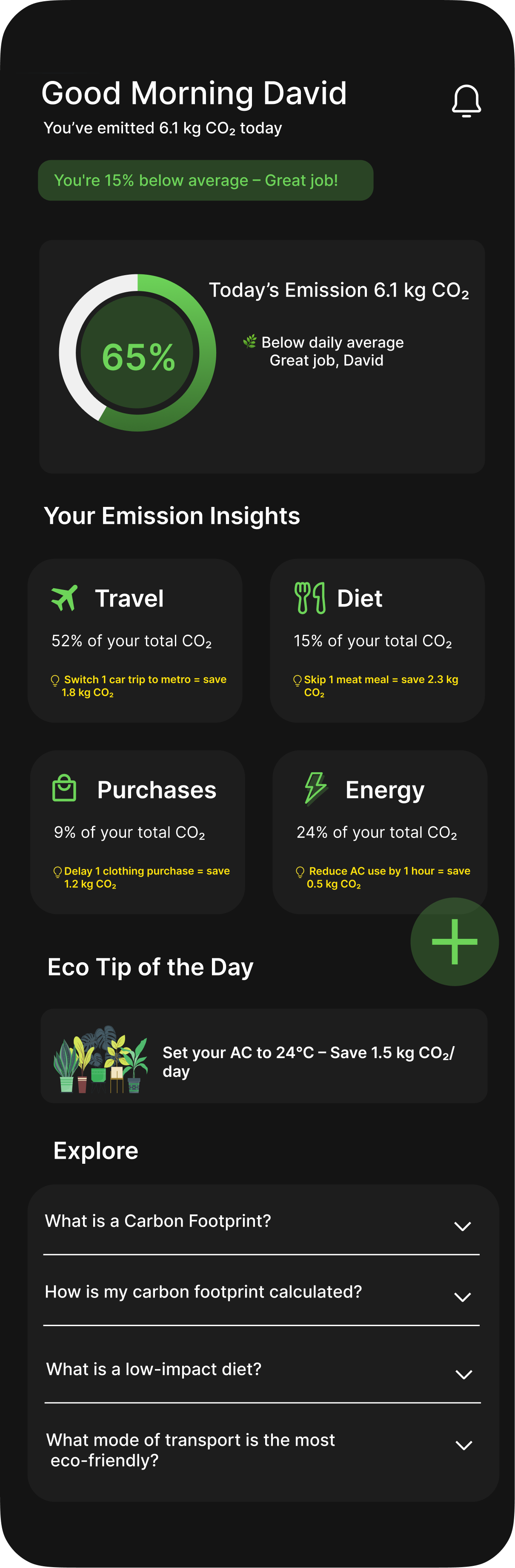
Home Screen
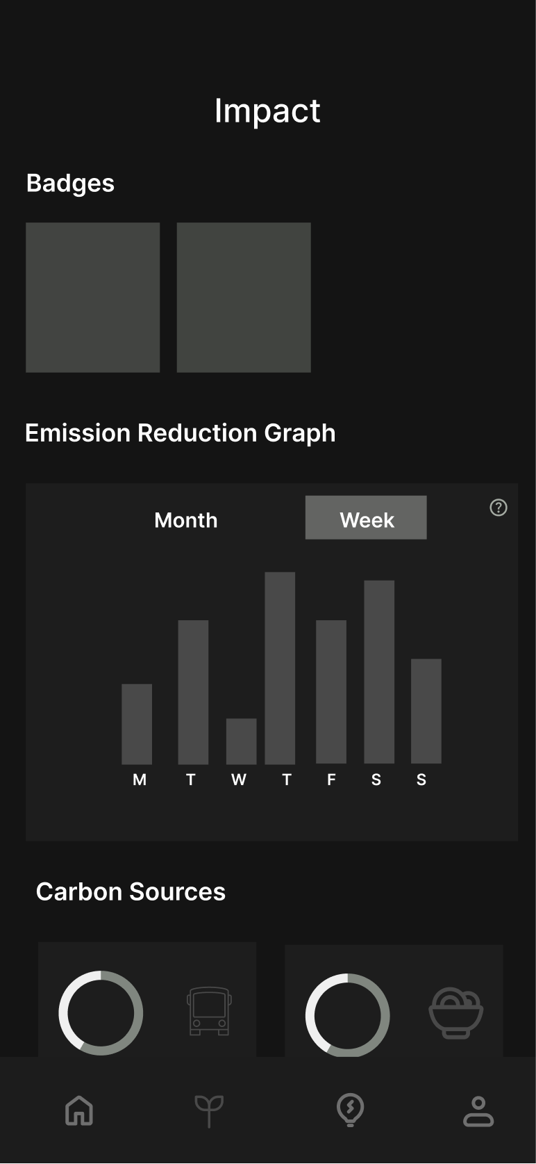
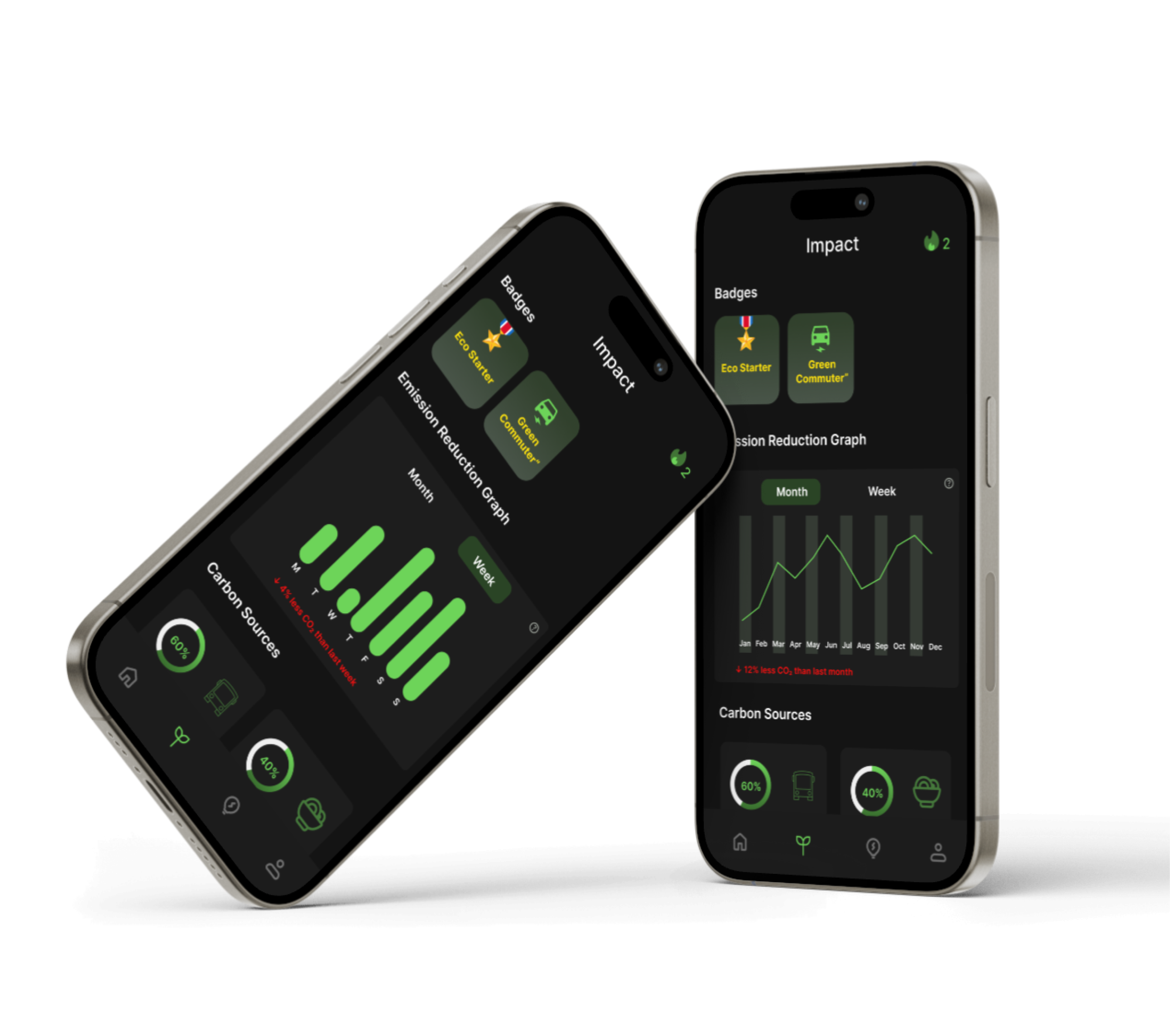
Impact Screen
Badges · Emission Graph · Carbon Sources
Answers “am I getting better?” through 3 lenses. Badges celebrate milestones. The emission graph shows actual CO₂ reduction over time. Carbon Sources shows the donut of where emissions come from, so users can identify which category to work on next.
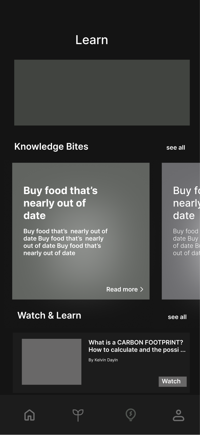
Learn Screen
Eco Quiz · Knowledge Bites · Watch & Learn
A standalone “Learn” tab doesn't get opened. So this screen mixes formats: an Eco Quiz for engagement, Knowledge Bites for quick reads, Watch & Learn for video. The tracking panel on the same screen proves that learn and log belong together.
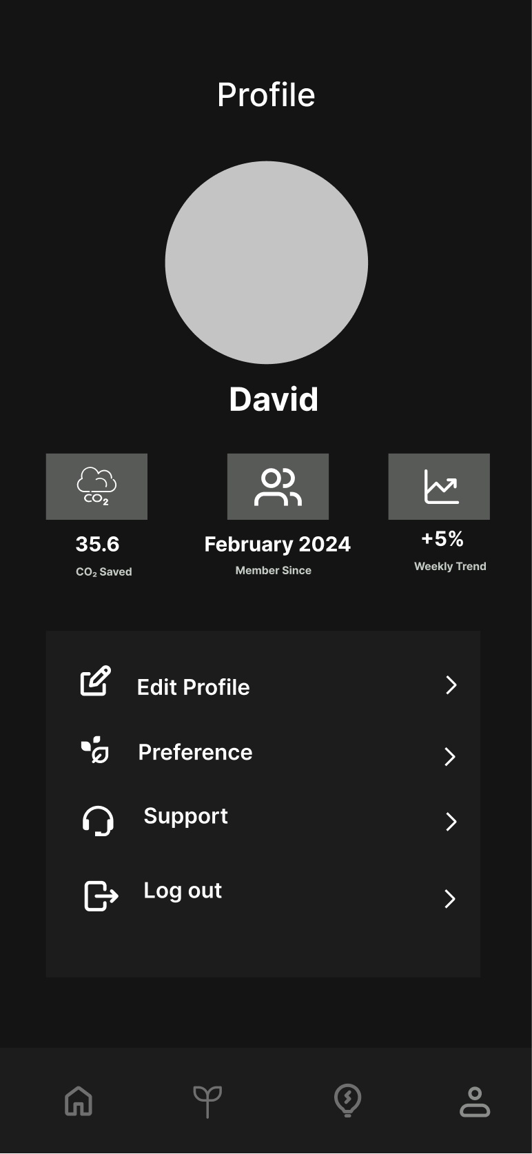
Profile Screen
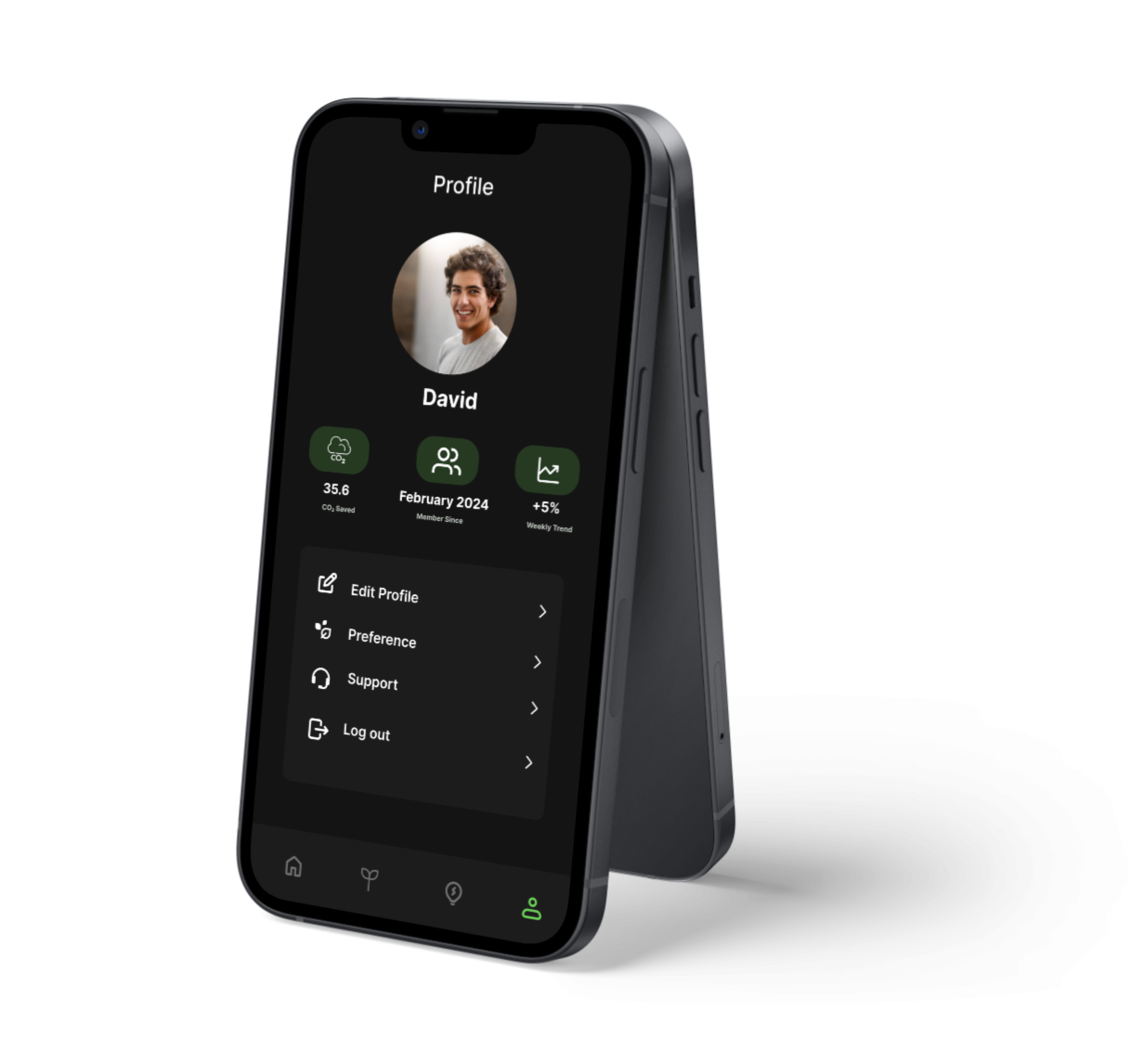
David · 35.8 kg CO₂ Saved · Member since February 2024
3 stats directly below the avatar: CO₂ Saved, Member Since, and +5%Weekly Trend. Answers “am I getting better?” with no leaderboard, no streak counter. Personal progress only.
Edit Profile
›Preference
›Support
›Log out
›The screens looked right in Figma. Then real users sat down with them.
User Testing & Before After
Two hypotheses that failed. And what replaced them.
Documented as hypothesis-test-update cycles. The original decisions had reasoning. And that reasoning was wrong.
Round 1 Task Completion (n=5)
Log a commute
3/5
Compare weeks
5/5
Find a tip
4/5
Add a weekly goal
2/5
Tasks 1 and 4 failed due to navigation, not content. The fix was structural.
What I Observed
The Add Button. From Hidden to Front and Centre.
✕ Hypothesis (V1)
Centered tab bar button. The add action is the primary action on home. It belongs on the screen, not in navigation chrome.
✓ Updated Design (V2)
Floating action button. Round 2: all 5/5 testers found it immediately. The FAB signals primacy.
Carbon Charts. From Technical to Human.
✕ Hypothesis (V1)
Carbon Metrics: Today
Transport CO₂e
0.8 kg
CH4 equiv: 0.03
Electricity kWh
1.1 kg
Scope 2: indirect
Food LCA
0.5 kg
Land use: 0.2
Total: 2.4 kg CO₂e · Scope 1+2
3 testers: "meaningless" or "like seeing calories on a menu, just guilt." The problem wasn't the design. It was the frame.
✓ Updated Design (V2)
Today's impact
↓ 18% vs yesterdayTransport
≈ 8km drive
Energy
≈ 2hrs AC
Food
≈ 1 meat meal
Good day. Below your weekly average.
Comparative framing (↓ 18% vs yesterday) with plain-language equivalents. Same data, different register. After: users said "motivating," not "depressing."
Outcomes
Two iterations. One word that said everything.
The numbers improved. But the most telling signal was the language participants used.
Round 1 · Most said
“complicated”
Every screen competed for attention
→
2 iterations
Round 2 · Most said
“simple”
Same data. Prioritised, not reduced.
3 of 4 tasks improved — here's what moved the needle
Log a morning commute
3/5
5/5
↑ FAB replaced buried tab button
Find an actionable food tip
4/5
5/5
↑ Comparative framing replaced raw CO₂ numbers
Add a new weekly goal
2/5
4/5
↑ Goals separated from the Profile tab
Key Learnings
What this project taught me. Including what I got wrong.
Not general principles. Specific things I didn't know before, or thought I knew and found out I didn't.
The problem I thought I was solving wasn't the real problem
I started this project thinking the gap was bad UX. Research showed the real gap was emotional. Users felt judged by their own data. That one reframe changed almost every design decision I made after it.
What I cut mattered as much as what I built
I started with 23 features. Every feature I cut in scoping made the features I kept stronger. The quick-log flow only works because I didn't also try to handle carbon offsets on the same screen.
Research findings need a decision attached or they're just decoration
I ran 5 interviews and came out with 30+ findings. Most sat in a doc and affected nothing. The 3 that actually changed my design were written as decision sentences: 'Because users said X, I will do Y.' Next time I write those before synthesis, not after.
The before matters as much as the after
Documenting the reasoning behind V1 made the iteration story legible. I assumed the original design's logic was obvious. It wasn't, and capturing it made the case for change much stronger than just showing the updated version.
What I'd do differently
I'd design for the unhappy path. Every screen I built shows a successful, populated state. I never designed for day one (no data yet), a bad week (numbers going up), or a user who wants to stop tracking. Those are real moments, and the prototype doesn't address them.
thanks for reading.
if this project made you think, it did its job.