Project Overview
A library built for 1995, used by students in 2024.
BibloFi was a 1-month Infosys internship project with weekly sprint deliveries. Each sprint had to ship; no room to over-iterate. We were handed an SRS document outlining every required feature, and the task was to turn those requirements into an experience that actually felt good on a real phone.
The context was the Infosys Mysore campus library: an immersive, well-stocked physical space running entirely on manual processes. Students had to physically visit to check availability, librarians handled everything at the counter, and there was no digital layer at all.
The Brief
Design the complete member experience of a library app for Mysore campus: onboarding, book discovery, seat booking, and fine tracking, in 4 weeks.
Team
1 designer (me) · 10 iOS engineers · 1 product owner

Design Process
Four weeks. One sprint review every Friday. If it didn't hold up, it was cut.
Every Friday was a sprint review with the dev team. If something didn't hold up, it was cut before Monday. This pace forced early decisions and prevented over-design.
Discover: Research
Understanding how students actually use libraries.
I surveyed 38 students and conducted 8 in-depth interviews across two campuses. Three observation sessions inside the library revealed behaviours that surveys alone would have missed. I also spent time with 2 librarians to understand the other side of every pain point students described.
Key finding: the friction wasn't in the library itself, it was in the invisible overhead. Not knowing if a book was available before visiting. Not being able to reserve a seat. No reminders for due dates. The failed visit, not the failed search, was the core pain.
Research framework: 5W 1H

What surprised us
We expected the main problem to be the book catalogue. It wasn't. The catalogue was fine. The problem was uncertainty before arriving: students couldn't know if a book was available or a seat was free without physically going there first.

From the interviews
"I walked 20 minutes to the library last month, and the book wasn't there. I'd already planned to sit in my usual spot, but of course you can't actually reserve one. I just went home. I haven't been back since."
B.Tech student, 3rd year · Interview participant
38
Students surveyed
8
In-depth interviews
3
Observation sessions
2
Librarians consulted
Define: Personas
Two students, two stories, one shared frustration.
Based on real research insights, I created two fictional personas representing the core user archetypes.
Composite insight from 8 student interviews
Riya Sharma
21 · B.Tech Student · Delhi · High tech comfort
Goals
Pain Points
Arjun Mehta
20 · CS Student · Greater Noida · Power user
Goals
Pain Points
User Journey Mapping
Mapping the full emotional arc, from intent to frustration.

Develop: Wireframes
Rough sketches to structured flows, problems caught early.
Brainstorming started in WhatsApp chats. Raw ideas became structured lo-fi wireframes in FigJam. Two structural problems were caught and fixed here — before a single hi-fi screen was opened.
Step 1 — Rough Sketches

Step 2 — Lo-Fi Wireframes

Structural problems caught before hi-fi
Two structural problems surfaced immediately. The bottom tab bar had five items — one too many for comfortable one-handed use. The 'Issue Book' action was buried three taps deep, flagged in the first five minutes of testing. Both were fixed before opening Figma in hi-fi: tabs dropped to four, and issuing a book became a persistent action from the catalogue view.
7 flows designed: Onboarding · Sign In · Browse by Genre · Search by Author · Scan & Search · Notifications & Profile · Seat Booking
Develop: Constraints & Tradeoffs
What we worked within, and what we chose to cut.
Real projects have real limits. These constraints shaped every major decision in the design, and naming them is part of the work.
4-week hard deadline
Infosys internship sprint with no extension. 7 core user flows were locked in week 1. Anything beyond that was explicitly deferred to a Phase 2 doc.
iOS 18 HIG compliance
No custom navigation patterns. Native components only, which eliminated several interaction ideas that would have required bespoke animation work from the dev team.
No real-time push backend
Push notification infrastructure wasn't available in this sprint. The seat waitlist idea was cut; a booking-only model became the viable path.
Three features deliberately cut
Audiobook streaming, a librarian-facing admin panel, and in-app fine payment were de-scoped in week 3 to protect the quality of the 7 core flows. All three became Phase 2 recommendations.
The hardest tradeoff
The seat waitlist feature tested better than the booking-only model in concept testing. But the push notification backend would have taken two weeks to build, leaving no time to test the core flows. A well-tested booking flow at handoff is worth more than a partially-built waitlist. The waitlist went into the Phase 2 doc with full specs.
Deliver: Key Features
Three features that make library visits optional.
Colour
Warm orange-brown (#C8703A), chosen to feel approachable rather than institutional. Libraries should feel inviting, not cold.
Typography
iOS 18 system font (SF Pro) throughout, required by HIG and native to every iPhone user. Hierarchy through weight and size, no decorative typefaces.
Components
Built on iOS 18 UI Kit (Figma Community). Native sheets, tabs, and cards so the engineering team had direct SwiftUI analogues with no bespoke component work.
01
📖 Smart Book Discovery
Find any book before you even leave home.
Students were wasting time visiting the library only to find the book they needed was already issued. The search system lets users browse by genre, search by author, or scan a barcode, and see real-time availability before making the trip.
Why this approach
Students weren't browsing for new reads. They arrived with specific titles in mind. Real-time availability confirmation was the primary need. We designed for certainty, not discovery.
What we considered first
A 'you might also like' recommendation engine was explored first. Rejected because it solved a secondary problem while leaving the primary one (is this book available right now?) completely unanswered.

02
🪑 Study Seat Booking
Reserve your spot before you arrive.
Seat unavailability during exam season was the single most-mentioned pain point across all 8 interviews. Students can view the study hall layout, select a seat, and get a confirmation before leaving home.
Why this approach
11 of 12 students who stopped visiting regularly cited seat uncertainty as the reason. This single feature had the highest potential to change real behaviour.
What we considered first
Waitlist notifications were cut; push infrastructure wasn't available in the sprint. Booking-only became the viable path.

03
📷 Scan & Search
Point your camera. Find the book instantly.
Observation sessions showed students physically pulling books off shelves one by one to check availability. A barcode scan closes the physical-digital gap in under 3 seconds, no librarian needed.
Why this approach
Observation sessions revealed the behaviour we needed to eliminate: students walking rows of shelves, pulling books out, asking librarians for status. The scanner makes the librarian's most-repeated task self-serve.
What we considered first
A campus-map shelf locator was explored first. Rejected: students already knew the layout. What they didn't know was whether the book was on the shelf right now. The scanner solved the real problem; the map solved one that didn't exist.

Deliver: Final Designs
The finished product, every screen, polished.
From onboarding to book discovery, seat booking to fine tracking, final high-fidelity screens delivered to the Infosys engineering team.
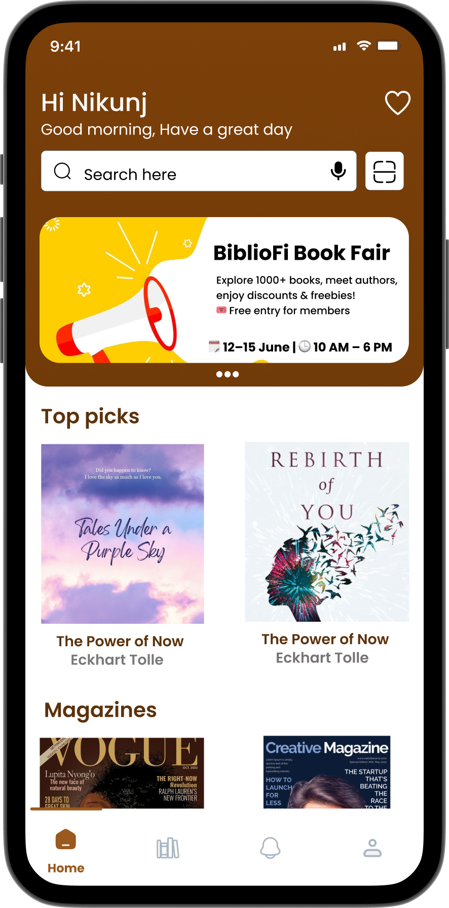
Complete Library Experience
Inspired by the word Bibliophile, a person who loves books. Designed to feel like home for every reader on campus.


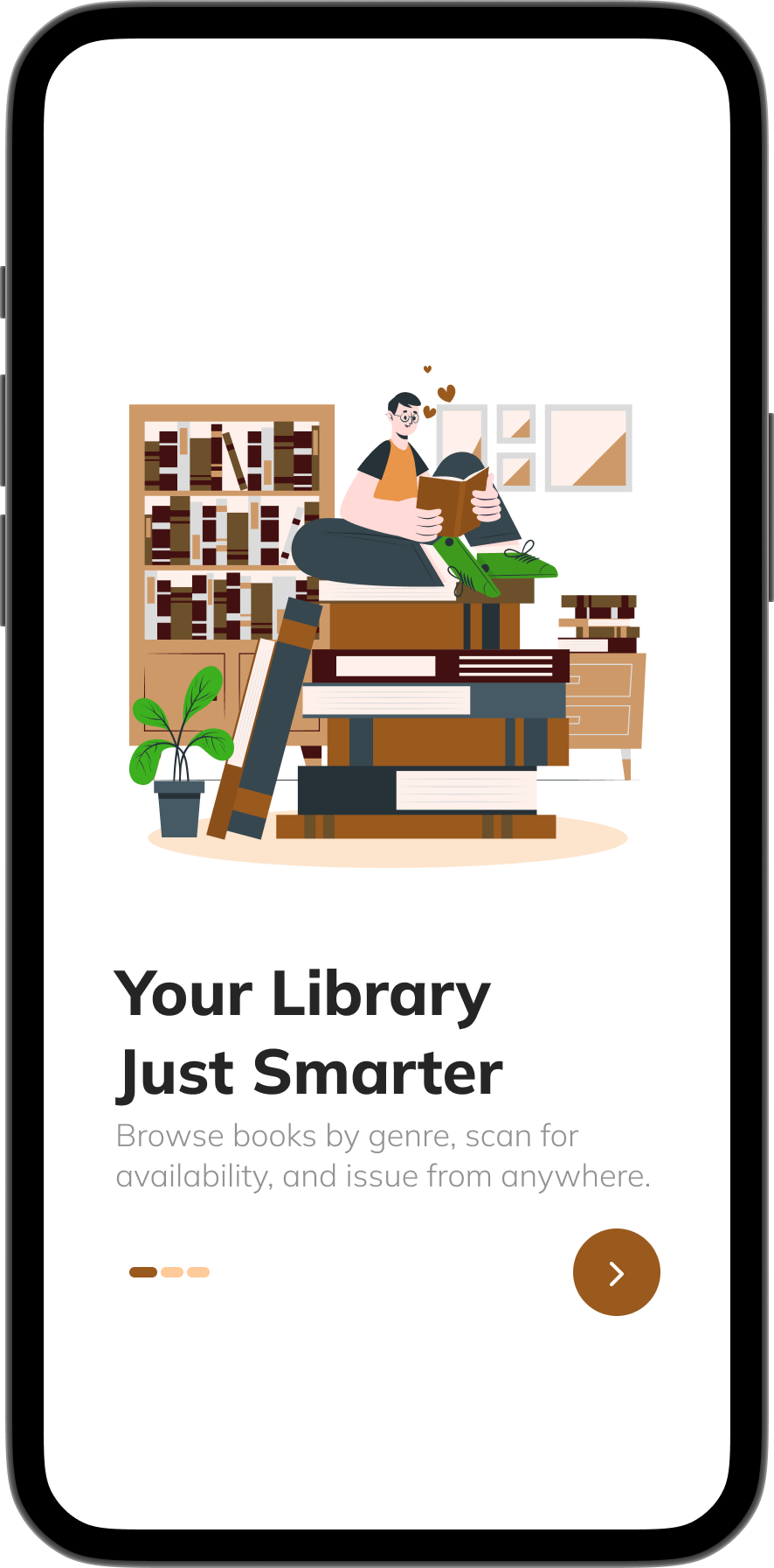
4-screen onboarding flow · swipeable · skippable · no sign-up gate
Genre Discovery
Tell us what you love to read.
Pick your genres →
Students choose from a rich list of categories: Fiction, Science, History, Technology and more, in a single tap flow.
One-time personalisation →
Set once during onboarding and the app remembers. Genre preferences persist across sessions without any settings menu.

← Shapes recommendations
The selections directly feed the Home screen's "Top Picks for You" section; what you choose here is exactly what surfaces there.
← Reduces discovery friction
Instead of browsing a flat catalogue of hundreds of books, students land on a feed already filtered to their interests.
The central hub of the app where users can access trending titles, recommendations, and personalized updates.
Search →
Quickly find books using an intelligent, multi-filter search bar.
Event & Promo Card →
Display promotional banners for book fairs, events, or important notices.
Top Picks for You →
Curated book recommendations based on popularity and user preferences.
Membership Card →
Shows your active membership status, renewal info, and ID details.

← Smart Notifications
Stay updated with the latest alerts, reminders, and library announcements.
← Book Scanner Shortcut
Instantly scan a book's barcode to check its availability or borrow status.
← Magazines & Novels
Discover trending magazines and novel collections in one place.
With categories spanning authors, genres, and personalized searches, BiblioFi gives me countless ways to explore and find exactly what I love.

They can easily reissue books, check upcoming events, and stay updated on any library notifications or reminders.
This centralized hub reduces friction, saves time, and ensures members never miss an important activity or opportunity within the library.
By combining all essential services in one intuitive interface, the Service tab makes the library experience smooth, organized, and highly user-friendly.
The Service tab is designed to provide members with seamless control over all their library interactions in one place. From reserving or cancelling study seats to keeping track of active bookings, users have everything at their fingertips.
Profile
Your library, your identity.

Accessibility & Inclusivity
Designed for everyone to use.
BibloFi was designed to be inclusive and accessible for all users, from day one, not as an afterthought.
Colour Contrast
Text and background colours tested using WebAIM Contrast Checker. Achieved a contrast ratio of 10.95:1, well above WCAG AAA standards for readability.
WCAG AAA, 10.95:1Text Scalability
Typography uses relative units and flexible layouts, ensuring readability across devices and font sizes, aligning with WCAG 2.1 guidelines.
WCAG 2.1 compliantScreen Reader Ready
Interactive elements, headings, and buttons are clearly labelled in the design to support VoiceOver and other screen readers on iOS.
VoiceOver compatibleTouch Targets
All buttons and tappable areas meet Apple's minimum size guidelines (44×44pt) for easy, accurate interaction on all iPhone models.
Apple HIG compliantDesign system built on iOS 18 UI Kit (Figma Community) and Apple's Human Interface Guidelines, ensuring the app felt native and familiar to iOS users.
Usability Testing
20 real users. Three core tasks.
Each participant attempted three core tasks without any guidance. No hints. No walkthroughs.
90%
overall task completion
12 points above the Nielsen Norman Group benchmark for well-designed consumer apps.
Task 1: Search a book
18/20
completed successfully
2 participants hesitated with filter options before needing guidance.
Task 2: Book a seat
17/20
completed successfully
3 found the confirmation step slightly unclear, restructured in final iteration.
Task 3: Check notifications
19/20
completed successfully
1 participant missed the icon placement initially.
Key improvement from testing: secondary navigation was unclear in early iterations. We restructured the tab bar and improved labelling, confirmed positively in final feedback sessions.
Post-delivery context
The Figma specs and design system were handed off to the iOS engineering team at internship end. These testing results represent the final pre-handoff validation, not production metrics.
What I Learned
Quietly growing, sprint by sprint.
What this didn't fully solve
BibloFi solves the student's experience. It doesn't solve the librarian's. Every booking still requires manual work on the librarian's side. The admin panel was de-scoped in week 3; it's the most important thing missing, and it's what I'd prioritise in Phase 2.
Navigation is your first design decision
We had five tabs instead of four. Caught it in lo-fi, 20 minutes to fix. In hi-fi the same change would have cost two days.
One test session saves a week
A single usability session caught a broken booking flow before it shipped. That finding alone made the entire testing phase worth it.
Documentation is design
Writing rationale into Figma comments meant the dev team could unblock themselves by week 3. They were reading the notes without being asked.
Cut cleanly, document it, move on
Three features de-scoped in week 3. They didn't disappear; they became Phase 2 with full specs. Clean exits protect the work that stays.
What I'd do differently
Include librarians from day one. Push for six weeks. Build post-launch metrics into the brief before the internship ends.
What shipped
A complete library experience —
designed, tested, and handed off in 4 weeks.
7
core flows shipped
10
iOS engineers at handoff
90%
task completion rate
4wk
start to delivery
Internship Experience
Thank you, truly.
This is one of the best experiences — learned so much here. The Infosys team is so humble and kind.
Thank you, Virag sir, my mentor, and Prasand sir for the support and guidance. And to my friends, for making this a truly memorable moment of my life. ✨
Nikunj


Click to browse · 1/5